Hi, Dave Fox here from Starscape SEO. In the world of branding, nothing stays the same for long.
Just like businesses, mascots need to evolve to stay relevant, resonate with new generations, and keep up with shifting cultural trends.
From gruff and serious to sleek and friendly, some mascots have undergone transformations so extreme that they’re nearly unrecognizable from their original designs.
We understand that rebranding isn’t just about logos or taglines—it’s also about the face of your brand, and sometimes, it needs a major update to keep pace with changing markets.
Here’s a list of 10 brand mascots that have changed so dramatically from their first iterations that they are almost unrecognizable today:
Ronald McDonald (McDonald’s)
Then
Now
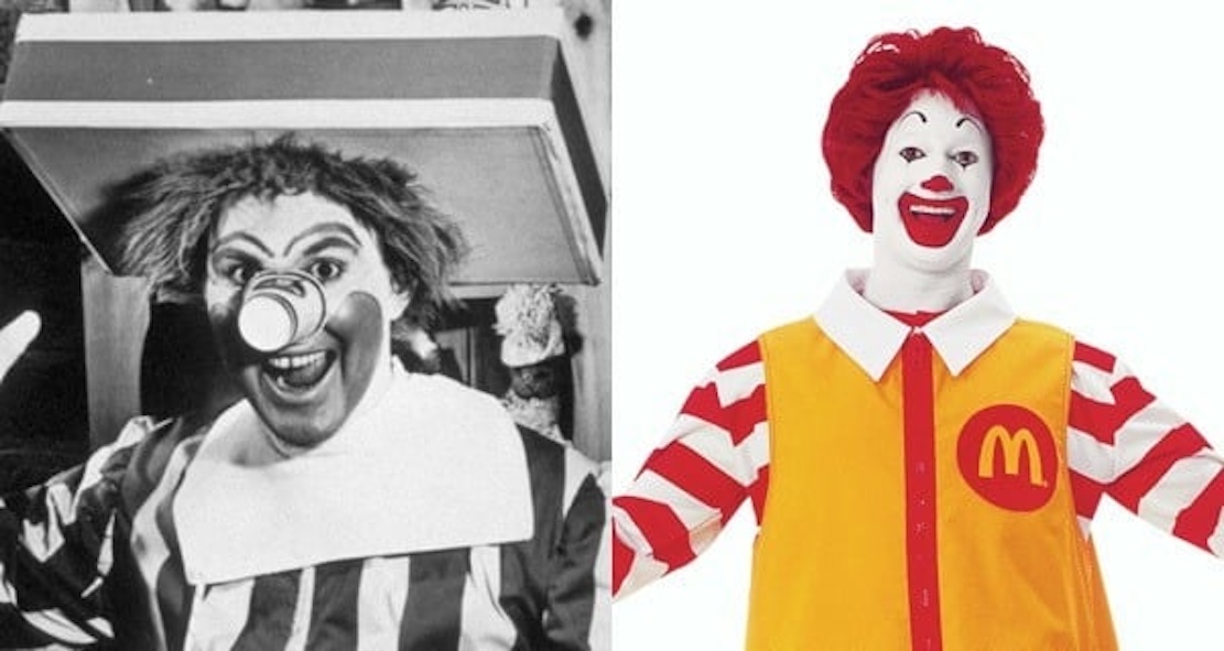
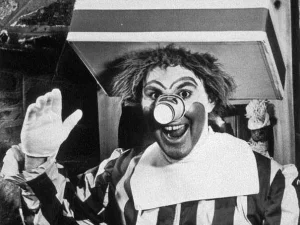
The original Ronald McDonald from the 1960s was a bit unsettling compared to today’s friendlier, cartoonish clown.
His early design featured a food tray for a hat and a cup for a nose, making him more of a strange fast-food jester than the polished clown we know today.
Ronald’s Evolution:
Initially, Ronald seemed more of a birthday party clown, with much tackier attire, and an almost medieval appearance that may or may not have aligned with professional clowns of the time.
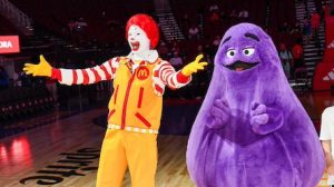
As McDonald’s skyrocketed in popularity from decade to decade, Ronald soon morphed into the red and yellow clown we know today.
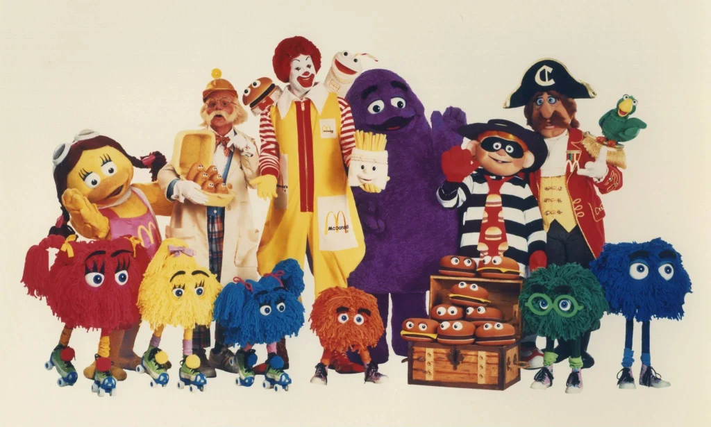
He became part of “McDonaldland”, which established a kind of “lore” for Ronald and a variety of McDonald’s characters that appeared over the years like Hamburglar, Grimace, Birdie, the Fry Guys, and so on.
However, as concerns about the portrayal of clowns in media and their potential to frighten children increased, McDonald’s adjusted Ronald’s appearance to be softer and more approachable, focusing on his role as a friendly guide to the restaurant experience.
In 2011, 550 doctors famously called for the retiring of Ronald McDonald, on the grounds that having a clown try to sell fast food to children was unethical. Since then, Ronald has been much more elusive, although he can still be seen as the mascot for Ronald McDonald House Charities.
The 2016 “clown sightings” didn’t help either. Around this time, there was a spate of people dressed up as clowns who would harass the general public in the style of various horror movies, making clowns even more frowned upon.
Overall, Ronald has become a symbol for fun, inclusivity, and community engagement, reinforcing McDonald’s commitment to creating a welcoming environment for families while ensuring that he remains a beloved and recognizable figure in popular culture.
An interesting side note is that on Ronald’s Wiki page, his age is listed as 61 (immortal). Yes, he is officially immortal, ie. similar the Valar in Lord of the Rings.
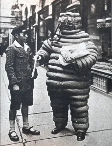
The Michelin Man (Michelin Tires)
Then
Now
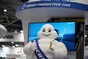
The Michelin Man, also known as Bibendum, was originally a bulky, cigar-smoking figure with a more intimidating, industrial look.
Over time, he has slimmed down and become more family-friendly, now appearing as a cuddly figure made of white tire-shaped segments.
The Michelin Man’s Evolution:
The Michelin Man has undergone a significant transformation from his original design, which featured a more amorphous, rough appearance, to the smoother, more approachable figure seen today.
For anyone familiar with the movie “Ghostbusters”, the Michilin Man appears somewhat similar to the fictional Stay Puft Marshmallow Man.
This shift for the Michilin Man can be hypothesized as a response to evolving consumer perceptions of branding and comfort, similar to our friend Ronald McDonald, who also morphed from a somewhat gritty individual, to a much more smooth and cuddly character.
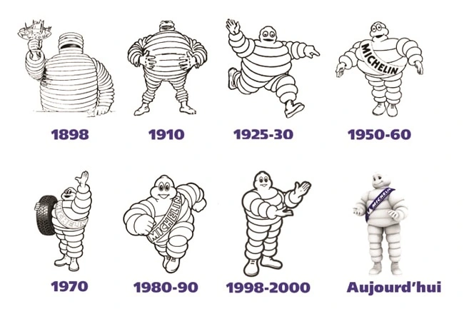
Certainly someone in a board room must have mentioned the idea of people waiting for their tires to be changed, and the idea that a child might encounter a happy cartoon man made out of inner tubes might be similar to a run in with Santa Claus.
Initially intended to represent the strength and durability of Michelin tires, the Michelin Man’s redesign emphasizes friendliness and accessibility, aligning with the company’s message of safety and reliability on the road.
By presenting a softer, more rounded figure, the character invites consumers to view Michelin as a trustworthy companion for their journeys, while also appealing to families and individuals looking for reassurance in their tire choices.
This evolution not only reflects changing aesthetics in advertising but also reinforces Michelin’s commitment to customer care and innovation in the automotive industry.
Tony the Tiger (Kellogg’s Frosted Flakes)
Then
Now
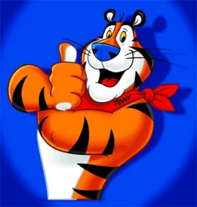
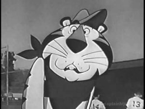
Tony started out as a fairly lanky, bandana-wearing tiger in a nondescript cap back in the 1950s.
Over the years, he bulked up, became more muscular, still wears the bandana, and now exudes a confident, athletic persona that aligns with his catchphrase, “They’re grrreat!”
Tony The Tiger’s Evolution:
Tony the Tiger’s transformation from a tall, boomy-voiced cartoon Tiger who helps kids to a more well-muscled boomy-voiced CGI tiger who helps kids has more to do with animation style, but that, in turn, is based on some mysterious marketing strategy.
Come to think of it, he does look a lot different, with the obvious thing being he goes from dull black-and-white to high-definition colour, but he also physically does appear different, aligning with changing views of masculinity.
Tony has always basically been a symbol of being a coach or father-figure, obsessed with getting the best out of his mainly male audience, never really portraying a role model for females at first, but over time becoming a more all-purpose role model for all.
Being such a health enthusiast, while coaching little league, can be seen as ironic as Frosted Flakes are as sugary a cereal as any, leading to all of the problems one encounters consuming a high sugar diet, such as obesity and heart problems.
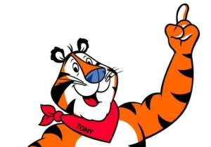
Nonetheless, the more big-and-strong modern day Tony The Tiger conveys a sense of power and total confidence, never failing, and always aligning with the message of sportsmanship and achievement that Kellogg’s promotes.
By adopting this robust, coach-like persona, Tony appeals to both children and parents, reinforcing the idea that starting the day with Frosted Flakes can contribute to a strong, healthy lifestyle, while also nurturing a sense of fun and adventure in the breakfast experience.
Like our previous two mascots, there is a sense of immortality and superhuman ability that goes along with Tony, who seems to be unflappable once he’s consumed his Frosted Flakes.
My understanding is, like Ronald, Tony eventually got informally retired, as television and the commercials on television basically have become somewhat obsolete.
If you visit the Frosted Flakes website, you’ll notice that Frosted Flakes actually highlights Tony’s journey, and you can see where he is today.
The Geico Gecko (Geico Insurance)
Then
Now
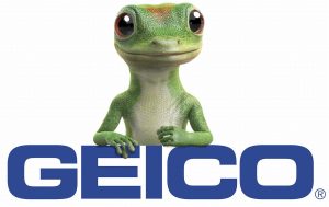
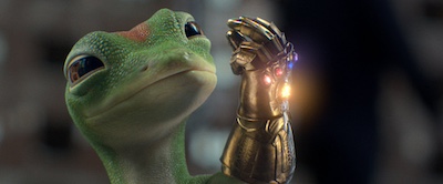
When the Geico Gecko first appeared in 1999, he was more of a traditional, somewhat bland-looking lizard with minimal personality. Some may argue, but that’s my take.
Today, he has morphed into a cheeky, anthropomorphic gecko with a British accent, representing the brand with a witty, memorable presence.
Geico’s Evolution:
The Geico Gecko’s shift in appearance over the years can be hypothesized as a strategic move to enhance brand relatability and appeal to a broader audience.
Originally designed to be more cartoonish and whimsical, the Gecko has evolved to adopt a sleeker, more polished look that reflects contemporary animation trends and consumer preferences for authenticity.
Could it be that Geico Gecko may not have initially been thought of as a long-term mascot for the brand – maybe just a one-off for a commercial to see if it sticks.
With insurance, it must be difficult to come up with a mascot that truly resonates, as insurance is about as exciting as doing laundry for most people. BO-RING. A real snore-fest.
Apparently Geico’s Gecko did make an impression back in ’99, and so the wheels of corporate interest began to turn in an effort to make that crazy gecko something that could leave a lasting impression on the viewer.
Could it be the new Sonic The Hedgehog of the insurance world? Time would tell.
I can hear the boardroom meeting echoing in my mind almost like I was there, “Should we make him more funny, or should we make him more respectable? Hmmm…WHAT SHOULD WE DO WITH HIM?”
What ended up happening was a transition that likely aimed to create a stronger emotional connection with viewers, making the character feel more approachable and trustworthy in a competitive insurance market. Everyone trusts a happy-go-lucky Brit, oy?
By aligning his appearance with modern aesthetics, and a love of some stone-friendly CGI, Geico Gecko reinforces its brand identity as innovative and customer-focused (while still appealing to fans of wacky mascots), ensuring the Gecko remains a memorable and effective mascot in an ever-changing advertising landscape.
Mr. Clean (Procter & Gamble)
Then
Now
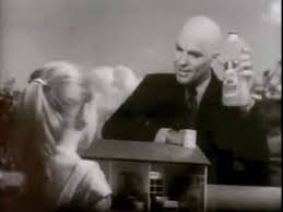
The original Mr. Clean from the 1950s was a stern, older man with more of a hardened expression.
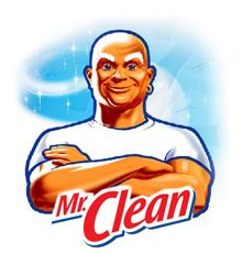
Over the years, he became more youthful, fit, and smiling, transforming into the friendly and modern bald icon with a white T-shirt we see today.
Mr. Clean’s Evolution:
Mr. Clean’s evolution reflects a broader shift in consumer expectations around cleaning products and household care.
Introduced in 1958, the original Mr. Clean mascot was a muscular, bald man with a serious, almost stern expression, representing strength and effectiveness.
His appearance embodied the idea that this product could tackle the toughest cleaning jobs.
There was little fun about Mr. Clean – keeping things spotlessly clean was obviously serious business, but culture began to change, and there was a need for a change in Mr. Clean’s tone that wasn’t like being visited by a guy who is a cross between a lawyer and a mortician.
Over time, Mr. Clean has softened slightly, with his features becoming more approachable, smiling, and friendly while still retaining his muscular build.
Obviously a connection was being made between keeping things clean and being healthy and hale.
Mr. Clean may be older, as evidenced by his white eyebrows, and matching white attire, but he certainly wasn’t “older” in the sense of being frail and wrinkly.
Quite the contrary – housewives perked up noticeably when Mr. Clean would arrive, or appear, in a sort of genie like fashion. In a way, Mr. Clean is like the god of chores, prayed to by the housewives of America, and, by extension, the world.
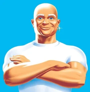
From a marketing and branding perspective, the modern version of Mr. Clean represents more than just toughness—he embodies efficiency, reliability, and even a sense of trustworthiness. In fact, when Mr. Clean is around, the concept of doubt doesn’t even exist.
By refining his look, the brand has been able to appeal to a wider audience, particularly households looking for a product that feels both powerful and safe to use.
The mascot’s evolution mirrors the broader shift in consumer preferences toward cleaning products that are not only effective but also aligned with the values of cleanliness, trust, and user-friendliness.
You can’t even really call Mr. Clean a mascot – he’s another one of these demi-gods, taking a recognizable form to visit people and clean everything, as the song (his personal anthem) says – doors, floors, laundry too, etc. etc.
He’s your go-to guy – so trusted, he’ll change your baby’s diaper and that isn’t going to be a problem for anyone. In the modern era, Mr. Clean does everything he used to do, and MORE. He can even clean your SHOES.
The Jolly Green Giant (Green Giant)
Then
Now
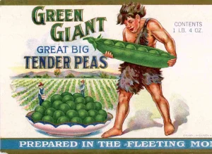
In his early days, the Jolly Green Giant wasn’t so jolly—he appeared more like a teenaged neanderthal-esque figure with a less jovial expression. “Ho, ho, ho!” was not in his vernacular at this point.
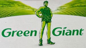
Today, he has softened into a smiling, welcoming fatherly giant in somewhat revealing leafy attire that symbolizes fresh, healthy vegetables and endless abundance.
The Green Giant’s Evolution:
The Green Giant has undergone a significant transformation over the years, reflecting evolving market demands and consumer perceptions.
Originally introduced in the 1920s as a peapod holding feral child, the Green Giant was meant to represent the strength and vitality of fresh produce, but this odd representation didn’t exactly capture the nation’s imagination.
It also logically didn’t add up. If he was a giant, why were the peas bigger than him? So much confusion, but who knew that the brand was named after these specific giant peas – the Prince of Wales pea?
In any case, the Green Giant marketing team sprung into action, evolving their mascot to be less of a pea-coloured teenager caveman, and more of a – yes – another demi god like the others, this time the smiling god of produce and abundance.
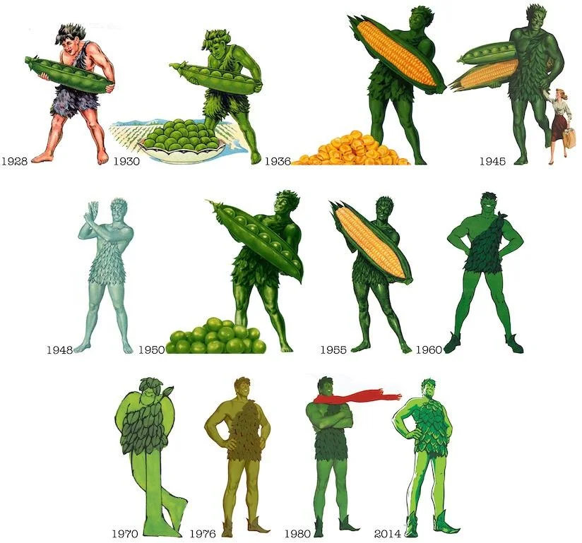
Over time, the character was softened to become the smiling, friendly figure we know today, with bright green skin and a welcoming demeanor. It seemed that his skin tone often changed, from pea green, to mint green, to evergreen, to emerald green, to army green, and finally to … spring green?
This shift in appearance paralleled a rebranding strategy focused on health, nature, and wholesomeness as consumer preferences shifted toward healthier eating and natural ingredients.
There had to be some focus groups happening throughout his evolution, or some sort of vote to establish what green he should be this year.
From a marketing standpoint, the reimagined Green Giant symbolizes purity, freshness, and a connection to the earth—qualities that appeal to modern consumers looking for nutritious food options.
The brand needed to evolve to reflect the growing demand for healthier lifestyles, and by giving the Green Giant a more approachable and nurturing persona, it reinforced the idea that its products are wholesome and family-friendly.
This transformation illustrates how a brand mascot can pivot to meet the emotional and cultural needs of the time, while still maintaining its core identity.
The Quaker Oats Man (Quaker Oats)
Then
Now
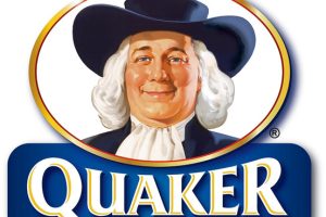
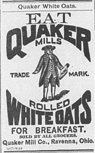
Larry, the Quaker Oats man, has undergone a series of quiet but impactful makeovers since his first appearance in 1877.
While the changes may seem subtle, they’ve transformed him from a chubby, elderly figure into a slimmer, more refined gentleman with a smile that whispers, “Yes, I can still make your heart healthy.”
Larry’s Evolution:
When Larry first hit the scene in the 1800s, he wasn’t just any old guy in a wide-brimmed hat—he was the poster child of wholesome, rustic living.
His early look was a little stodgier, evoking the image of a kindly grandfather who had probably spent his days harvesting oats in a field, chuckling softly to himself about the good ol’ days of, well, oats.
Back then, the vibe was all about purity, and Larry’s rounder face and more serious expression reflected that traditional, no-nonsense Quaker vibe.
But, much like Ronald McDonald’s unsettling jester origins, Larry wasn’t immune to the inevitable winds of change.
As the decades passed and consumer tastes shifted, Quaker realized that Larry was going to need a glow-up if he wanted to stay relevant in a world filled with kale smoothies and yoga mats.
And thus, the makeover began.
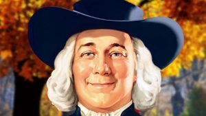 Modern Larry:
Today, Larry looks like he’s been hitting the gym, practicing mindfulness, and maybe sipping on the occasional green juice.
Gone are the chubby cheeks—now replaced by a more streamlined, healthier appearance.
His once-stern expression has softened into a knowing smile that seems to say, “I am oats, but I’m also a lifestyle.”
It’s a look that’s far more in tune with the times, where oats aren’t just for hearty breakfasts anymore—they’re for overnight oats, oat milk, and even DIY skincare.
Hypothesis as to why:
The big brains behind Larry’s makeover were likely responding to a cultural shift where people no longer just want a bowl of oats, but the promise of wellness in every spoonful.
By trimming down Larry and giving him a friendly smile, Quaker Oats has cleverly aligned their mascot with modern health trends, offering a mix of tradition and vitality.
And yes, Larry still wears that iconic Quaker hat—but now it feels less like a relic of old-timey Pennsylvania and more like a casual, cool accessory. It’s as if he’s saying, “Hey, I’m here for the heritage, but also, have you tried overnight oats? They’re life-changing.”
Fun fact: Quaker Oats once joked that Larry’s age is eternal. Yes, ANOTHER ONE. He’s not just a mascot, folks—he’s like Gandalf, but for oats.
Chester Cheetah (Cheetos)
Then
Now
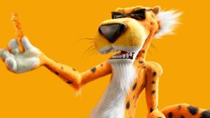
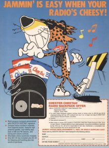
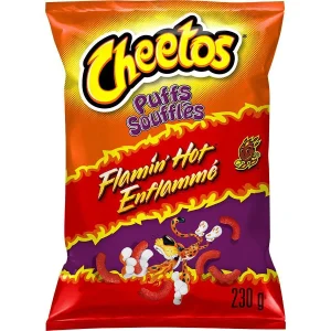
Chester Cheetah started off as a goofy, exaggerated cartoon in the late 1980s, but much like the snack he represents, Chester evolved into something bolder, crunchier, and just plain cooler.
In his early days, he had the vibe of a lovable goofball—a bit clumsy, with a penchant for slapstick antics. Today, though? Oh, he’s got shades on, a sleek fur coat, and more swagger than you can shake a cheetah tail at.
Chester’s Evolution:
When Chester first hit the scene, he was all about being “too cool for school.” Think of him as the cartoonish embodiment of the kid who wouldn’t do his homework but still somehow aced every test.
He wasn’t trying too hard—he didn’t need to. But times change, and so do snack mascots.
As consumer cravings leaned more into the realm of bold flavors and quirky humor, Chester evolved, too. Gone was the laid-back, passive cool cat.
Enter the new Chester: trickster, snack thief, and ultimate chaos agent. Now he’s the kind of guy who’d sneak up on you, swipe your bag of Cheetos, and leave behind a trail of cheesy dust just to make sure you know who did it.
He’s not just mischievous—he’s the embodiment of snack rebellion.
Hypothesis as to why:
Why the transformation, you ask? Well, Frito-Lay needed Chester to reflect the spirit of their flamin’ hot brand. People don’t just want a cool cat—they want a snack icon who feels alive, unpredictable, and downright wild.
Chester’s shades may still scream “cool,” but his zany antics say, “I’m here to stir things up.” You’ve got this Cheetah sneaking around like he’s the James Bond of snacks, living on the edge with every crunchy bite.
As Chester morphed into this snack-world trickster, he became a symbol of fun, spontaneity, and a little bit of cheeky rebellion—a perfect match for the unapologetically bold flavors of Cheetos.
Whether he’s teasing kids or pulling off heists involving snack bags, Chester embodies a brand that’s just as bold as it is playful.
Modern Chester:
Chester now rocks the modern, “I dare you to resist” look—complete with slick animations and social media stardom.
He’s not just a mascot; he’s a cultural icon, straddling the line between snack food and a high-stakes, cheesy adventure. Every time you grab a bag of Cheetos, Chester’s practically winking at you, saying, “Yeah, you’re in for it now.”
And let’s be honest—he’s not just selling snacks. He’s peddling fun, mayhem, and a little bit of trouble, all wrapped up in cheesy goodness.
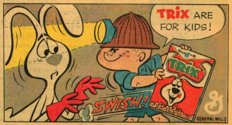
Trix Rabbit (Trix Cereal)
Then
Now
Colonel Sanders (KFC)
Then
Now
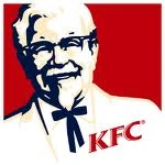
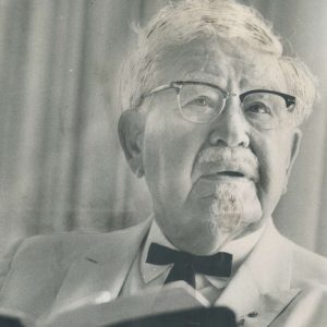
Colonel Harland Sanders started off as the real deal—a grizzled, white-haired Southern gentleman who looked like he might serve you fried chicken and give you a stern lecture on good manners.
His image as the face of KFC in the early days was a direct reflection of his real-life persona, complete with the distinguished white suit, black tie, and glasses, exuding the air of someone who knew his way around a chicken fryer.
The Colonel’s Evolution:
But over the years, something strange happened—like something out of a surreal commercial fever dream. Colonel Sanders didn’t just remain the smiling face of KFC; he became a meme-worthy legend of sorts.
Today, he’s been reborn as a playful, sometimes over-the-top, cartoonish figure.
Sometimes he’s a suave cartoon, other times he’s portrayed by various celebrities, from Reba McEntire to Rob Lowe. Yes, even Reba got to don the white suit and pretend she was the king of fried chicken for a minute. Why? Well, why not?
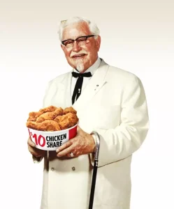
Hypothesis as to why:
It’s not just about slinging fried chicken anymore—it’s about capturing attention, especially with younger audiences who might be more interested in a bucket of hot wings if they feel like the Colonel is in on the joke.
KFC probably realized that the traditional Colonel Sanders image—while iconic—needed a serious update to stay relevant in a fast-moving, meme-driven culture. People don’t just want crispy chicken; they want entertainment with their crispy chicken.
Cue the modern Colonel Sanders, a man who isn’t bound by the laws of reality or time. KFC found a way to honor its past while making the brand fun by embracing a multi-dimensional, playful version of the Colonel.
You never quite know who’s going to step into those iconic white shoes next. The real genius here? KFC turned Colonel Sanders into a living, evolving character—both a nod to the company’s roots and a way to adapt to modern trends.
Marketing Magic:
There was likely a meeting at some point where someone stood up and said, “What if we make Colonel Sanders…a pop culture chameleon?
And what if…we put him in every timeline and universe possible?” Someone else in the room probably screamed, “Yes! Let’s get celebrities, let’s make him animated, let’s make him a meme machine!”
And it worked. This playful and exaggerated rebranding allows KFC to remain culturally relevant and keeps the Colonel in the spotlight while still tipping a hat to its deep-fried heritage.
Sure, it’s not the dignified Southern gentleman image anymore, but it’s fun—and in today’s world of fast food, fun is just as important as flavor.
These brand mascots have undergone significant redesigns to keep up with cultural shifts, marketing strategies, and consumer expectations, reflecting the power of visual evolution in keeping a brand fresh.

