Hi, Dave Fox here from Starscape SEO. So, you’ve decided to take the leap and start an online store. Fantastic! The digital world is vast, and there’s plenty of room for your unique products or services.
But before you dive headfirst into building your ecommerce website, let’s make sure it’s equipped with the essentials to attract and convert customers.

Call or Text Starscape SEO: (519) 208-8680

Here are 8 things a good ecommerce website should include:
A Clear and Intuitive Navigation
Your website is your customer’s digital storefront. It should be easy for them to find what they’re looking for.
A well-organized navigation menu, with clear categories and subcategories, is a must. Take a look at Nike’s desktop navigation menu…

While it’s not surprising that a multi-billion dollar company gets it right, I’ve seen this fairly simple strategy of making things look clean and simple made into a shockingly convoluted mess.
How? By having 800 category submenus, having weird illegible fonts, having weird colour schemes such as white text on light grey buttons.
Why do some online stores do this? Maybe because certain people are bad at web design, and sometimes things just get way out of hand, with no one in the business providing that critical feedback that would prevent such problems.
Ideally, shopping on an online website should be easy and enjoyable, right? Not stroke-inducing and miserable.
Oh, also – consider adding a search bar for those who know exactly what they want.
High-Quality Product Images and Descriptions
A picture is worth a thousand words.
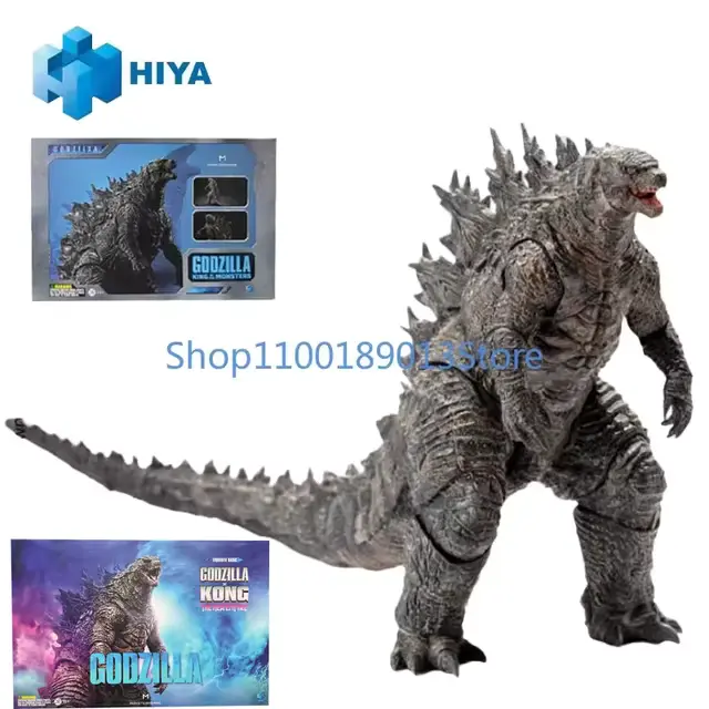
Ensure your product images are high-resolution, well-lit, and show the product from multiple angles. But not like this…

Detailed product descriptions should highlight key features, benefits, and materials.
If you look around the web, you’ll find online stores with all sorts of strange product pages, and you might notice that the more pixelated or janky the images are, the less trust you, and, by extension, others, will feel.
In a way, it’s almost hard to screw this up, as long as you understand that the picture of the product just needs to look good and be of the actual product, and the description needs to be written fluently in the language of the customers who use the website.
Shop around on Ali Express for a while, and you’ll see some wild stuff. Then again, they are based in China and they are trying to write in a foreign language. Chat GPT can’t always produce the best product descriptions, and so think about giving your store that personal touch that doesn’t sound like it was generated by AI.
A Secure Checkout Process
Online shoppers are increasingly concerned about security.
Use a trusted SSL certificate to protect customer data during the checkout process. Display security badges and reassure customers that their information is safe.
All of this security can become almost subliminal at a certain point, because, for web designers who are working with online businesses, the process of buying a product needs to be re-assuring from start to finish.
If there is any point along the way which has something, whether it be a dysfunctional part of the website, or the lack of certain accepted payment types – even a weird graphic like a flashing neon countdown clock – customers will either slowly or very quickly “bounce” away from the website, never to be seen again.
The “scam” website template is very popular these days, and people are mostly wise to it.

Even when a site is 100% wholesome and legitimate, even a well put together “cart” page is left incomplete just because a customer, or potential customer, got spooked by something along the way to the checkout that didn’t look right to them.
So your checkout process needs to be as iron clad as possible – remember that.
Multiple Payment Options
Offer a variety of payment methods to cater to different preferences.
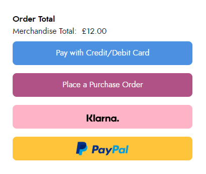
At a minimum, include credit cards, debit cards, and PayPal. Consider adding options like Apple Pay or Google Pay for a seamless checkout experience.
As I touched upon earlier in the article, customers gain trust through the osmosis of brands that they inherently trust, and here I’m talking about payment methods and companies they generally trust, like VISA, Mastercard, Paypal, etc.
Of course, you can’t just slap these labels on your website unless you truly do offer them – anything else is a lie and a fraud. Therefore, what you need is to have access to payment methods that are functional, and ready to accept payment.
Some website have additional services, like payment plans through things like Klarna, which can be great, but again – you need to really offer them and have all the kinks worked out.

I will tell you from my experience with things like Klarna, that I had to jump through some hoops to get it on my website, so I wouldn’t say that you can always just easily access all the payment types you want – everything needs to be cleared and double verified and functioning at 100%.
If you do get these payment options to work, then your customers will appreciate them.
Easy Returns and Exchanges
A hassle-free returns policy can significantly impact customer satisfaction.
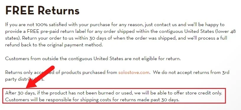
Clearly outline your return policy, including any fees or timeframes.
Make the return process as simple as possible, perhaps with prepaid return labels.
As the list of ways to make your ecommerce website something that customers will love, I will tell you that in my experience, getting to that point of having all of these factors under complete control with no flubs or flaws – it took a while, years in fact.
Policy pages, such as the return policy page that many ecommerce websites have (because they need a page to explain how this process works), requires an understanding of shipping, receiving, fees, taxes, and the laws around all of these things.

In other words, you don’t want to have a return policy page that contains a lot of yadda yadda blah blah blah.
It is indeed up to you as the business owner to know your stuff and actually have a return policy that you can explain to anyone that asks how it works without any confusion on your part, since you’re the seller. Also, these pages should be easy to access.
A lot of the time, they are either in the header or footer somewhere. Customers, not to mention Googlebot, needs to be able to access these pages to ascertain your brand’s legitimacy.
Mobile Optimization
More and more people are shopping online using their smartphones.
Ensure your website is fully optimized for mobile devices, which is known as responsive design.
This means it should load quickly, be easy to navigate, and display correctly on smaller screens.
A while ago, Google rolled out something called their “mobile first indexing”, which, as of now, is in full effect.

This means, if you do not have a website that looks good on a phone, Google will quietly disregard your efforts, because we have reached a point where the majority of online users actually use a smart phone.
For ecommerce business owners, this situation is that much more critical, because you are selling something, and if your ecommerce website can’t serve mobile users, then it’s going to get the stink eye from just about every human, robot, dog, cat, and baby on the planet.
Make sure it’s optimized for mobile!
Customer Reviews and Testimonials
Social proof can be a powerful tool for converting shoppers.
Encourage customers to leave reviews and display them prominently on your product pages. Not just that, but get them to leave a review on Google too.
Testimonials from satisfied customers can build trust and credibility.
In fact, it’s one of Google’s biggest ranking factors in terms of Google sharing your website more with the public.

Simply put, the more popular you are (as in, actually, not just in your own mind), the more Google loves you, and the more customers will also be drawn to you.
It can be rather tricky to build up a “fanbase”, but it’s something you really should keep in mind as you go along with your ecom brand – the idea that it’s important for customers to vocalize their support for you.
And how do you do this? Well, first, by having a great product or service. That is the first, and more important step. It should all follow from there.
Excellent Customer Support
Last but not least, a responsive and helpful customer support team is essential for a positive shopping experience.
Provide multiple contact options, such as email, phone, or live chat. Aim to respond to inquiries promptly and efficiently. The way I’ve done it in the past, and will do it again, is to keep notes on what my business has, and what it needs in terms of things like this.

If I need to make sure I have a chat box, it’s on a checklist for me to do. Once I have it, I want it to work flawlessly, or as flawlessly as it can work. This can mean hiring someone, or doing it yourself.
It depends how big your business is, but customer support, overall, is a critical element to any business. The easier your customers can get a hold of you to ask questions or lodge complaints, the more efficiently everything will run, and the more satisfied customers you’ll acquire.
Remember, a good ecommerce website is more than just a digital storefront. It’s a tool for building relationships with your customers and driving sales.
By incorporating these 8 elements, you’ll be well on your way to creating a successful online business.

