

Hi, Dave here from Starscape SEO. Back in 2015-2017, mobile-first indexing was a significant paradigm shift in how search engines crawl, index, and rank web pages.
The Rise of Mobile-First Indexing
Traditionally, Google and other search engines primarily crawled and indexed the desktop version of websites, and that’s where the priority was, but it eventually became clear it needed to change.
With the widespread adoption of smartphones and tablets, Google recognized the need to prioritize mobile user experience and ensure that search results are optimized for mobile users, since there were just as many, if not more people accessing the internet by smart phones.

I do recall all of this personally – that in around 2015, the SEO community was abuzz with the heads-up that Google was soon going to give preferential treatment to mobile-friendly websites, possibly more so than desktop-friendly sites.
This mobile-friendly focus was just one of many Google Core Updates that were rolled out over the years, and it was a big one because it meant “yes, smart phones are now to be taken as seriously as desktops when it comes to Google ranking factors.”
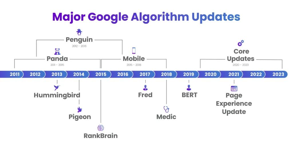
Here’s a chart showing some of the Major Google Algorithm Updates from over the years.
Today, in 2024, it’s clear that smart phones are here to stay and so Google has shifted its algorithm to make sure that a website does look great on a mobile device, and, if not, then keep it out of search results.
A Quick Note On AMP Pages

There was even a time around 2017 when online marketers like me were hearing about something called AMP (Accelerated Mobile Pages), which was an open source HTML coding method that supposedly was going to help when it came to web devs making mobile versions of websites load faster and more efficiently, and hence being better optimized for Google.
In a nutshell, web developers could make alternate versions of your web pages that had one version optimized for desktop, and one optimized for mobile (AMP page). It was supposed to help sites rank better, and I tried it, but it was just too much work, in my opinion.
Still, the fact remained, and still remains, that you need to optimize your website for Google and search engines in general by adding responsive design, and making things look good on smart phones. If your site looks bad on a smart phone, Google will notice and hold you back.
The Overall Importance of Mobile Optimization

Now let’s look at optimizing your website for mobile-first indexing, which is absolutely crucial for several reasons:
Improved User Experience
Mobile-friendly websites provide a better user experience for visitors accessing your site on smartphones and tablets.
Mobile-optimized sites are easier to navigate, load faster, and display content more effectively on smaller screens, leading to higher engagement and lower bounce rates.
Higher Search Rankings
With mobile-first indexing, Google considers the mobile version of your website as the primary source for determining search rankings.
Websites that are mobile-friendly and provide a seamless user experience on mobile devices are more likely to rank higher in mobile search results, increasing their visibility and organic traffic.
Expanded Reach
As mobile usage continues to rise globally, optimizing for mobile-first indexing allows you to reach a broader audience of mobile users.
By catering to the needs and preferences of mobile users, you can attract more visitors to your site and expand your potential customer base.
Which Sites Most Benefit From Mobile-Friendly Optimization?

Key Strategies for Mobile Optimization

To ensure that your website is well-optimized for mobile-first indexing, consider implementing the following strategies:
Responsive Web Design
Use a responsive web design approach to create a single, flexible website that adapts seamlessly to different screen sizes and devices.
Responsive design ensures that your website looks and functions optimally across desktops, smartphones, and tablets, eliminating the need for separate mobile and desktop versions of your site.
Mobile-Friendly Content
Create content that is easy to read and navigate on mobile devices. Use concise headings, short paragraphs, and bullet points to improve readability.
Optimize images and multimedia content for mobile viewing by compressing files and using responsive design techniques.
Page Speed Optimization
Improve your website’s loading speed on mobile devices by optimizing images, minifying code, and leveraging browser caching.
Use tools like Google’s PageSpeed Insights to identify and address performance issues that may impact the mobile user experience.
Mobile-Friendly Navigation
Simplify your website’s navigation menu and ensure that links and buttons are easy to tap on touchscreen devices.
Use a hierarchical menu structure and include a search bar to help users find the information they need quickly and efficiently.
Mobile-Specific SEO
Pay attention to mobile-specific SEO factors, such as mobile-friendly interstitials, app indexing, and mobile-specific structured data markup.
Optimize your meta tags, titles, and descriptions for mobile search to improve your visibility in mobile SERPs.
Conclusion

In an era where mobile devices reign supreme, optimizing your website for mobile-first indexing is no longer a luxury—it’s a necessity for maintaining a competitive edge in the digital marketplace.
By prioritizing mobile optimization and providing a seamless user experience for mobile users, businesses can improve their search rankings, attract more organic traffic, and ultimately drive greater success online.
Stay tuned for more insights on how to stay ahead of the curve in the ever-evolving world of SEO and digital marketing.
Call or Text Starscape SEO: (519) 208-8680