
Hi, Mahmudul Hasan here from Starscape SEO.
Today we’re going to do something a little different – we’re going to analyze some of the real estate logos in Waterloo Region (and surrounding areas) from both a design perspective, and a marketing perspective.
Here’s a version of our logo in black and white to kick things off (even though we are a digital marketing agency, but still…)
![]()
Real Estate Logos in KW Region – Let’s Have A Look, Shall We?
Kitchener-Waterloo Region, as you may be aware, is absolutely replete with REALTORS®, many of whom are savvy in the graphic design and marketing department, and many of whom, arguably, are not.
Keep this in mind as you read over this analysis, as it meant to be rather off the cuff, as opposed to set in stone. It’s just a discussion!
This is just our humble opinion, so bare with us. Hopefully this will be somewhat entertaining and informative, and if we happen to ruffle any feathers, well it was bound to happen at some point.
Enough idle chit chat, let’s dive in.
Real Home Experts

Based out of St. Jacobs, Ontario, and with a 5-star average rating on Google, Real Home Experts, if you check out their website, seem to have their visual aesthetic well in hand.
By that, we mean that if you happen to visit their website, the logo, which is located top left on desktop view, corresponds with the rest of the website. In terms of colour scheme, the entire look of the site we feel is rather copacetic.
The logo, in particular, has an artsy flair that catches the eye. Everything is spaced out meticulously, and the colours within the logo seem to work well with one another. It all seems very measured and the blue-greys are calming and somehow reassuring.
The favicon (which you see in your browser when you open a tab to the website) features the same intriguing triangular up-facing arrow shape that is the main insignia of the logo – continuity is good, and favicons provide an extra point in the marketing department. It shows awareness of those small details that some others lack.
Ok, let’s look at another!
Keller Williams Innovation Realty, Brokerage
Located in Kitchener, Ontario, with a 4 stars on Google, the first thing we’ll say here is that when we grabbed the Keller-Williams KW Innovation Realty, Brokerage logo from Google to use in this article, it came in the form of a .png file.
This means, for those not in the know, an image file without a background. In other words, here we have the type of file used to add easily to other image files, or even a snazzy t-shirt! (do they have shirts?)
It seems if you go to the Google My Business for this company, you’ll find the logo hitting different – on a jet black background like so:
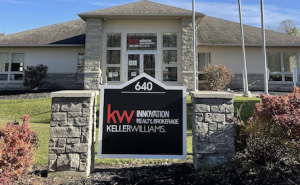
As far as the logo itself, the striking “kw” in red, juxtaposed next to the “INNOVATION” followed by “REALTY, BROKERAGE” on one visual plane, with the rest of the logo on the lower level, with various shades of grey highlighting each word, is a neat effect.
It’s like you’re looking at some kind of optical effect, causing your eye to bounce around, trying to sort it all out, but in a pleasing way. However, this only applies to the .png, as the version of the logo that is on their signage has white lettering.
In any case, it’s all very interesting and it highlights the point that many logos can exist in different iterations, and be used for different purposes. Clearly this business has the chutzpah to have a logo that is all letters, and yet still is, somehow, catchy.
Moving right along…
Cheryl Vansickle Real Estate
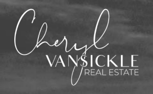
Located in Brantford with a 5 star average on Google, Cheryl Vansickle‘s logo is all text, and features her name in a combination of flowing script, juxtaposed with a less, shall we say, more straightforward, typeface.
The combination of fonts and styles with their classy white text-on-grey background appearance found on the website really sets a distinguished and beguiling tone. Here it is in context, as it seems necessary to give a more complete sense of the effect:

This reminds us to mention the fact that everything must be put into proper context, including and especially logos and where they can be seen.
For example, without the background image here (which still is only a part of the website), you wouldn’t get a sense for where the logo is placed in relation to other page elements, and the overall mood the page intends for the visitor.
This scene was obviously carefully considered by Cheryl and her team, and we hope she doesn’t mind that we are taking the time here to chat about it, providing some of our own commentary for the sake of interest.
The harsh reality, we suppose, is that anyone, including ourselves, can be scrutinized, with context removed. Still, in terms of this logo, we think it stands on its own as a very charming composition, which isn’t just functional, but also – in it’s own way – catchy.
CENTURY 21 CANADA

This CENTURY 21 CANADA logo is found nationwide here in Canada, and the CENTURY 21 company itself is part of a global real estate network with approximately 135,000 system members across 12,900 offices in 84 countries.
The company has nearly 400 offices across Canada. The exact number of employees specific to Century 21 Canada is not specifically known but the overall scale of operations suggests a significant workforce spread across its Canadian offices (CENTURY 21 CANADA).
As for the logo, we see it often on KW REALTOR® websites, indicating their affiliation that they legally must announce.
For example, if you take someone like George Lou Karmiris here, you’ll see he has his CENTURY 21 Heritage House logo on full display, which not only gives him that brand recognition of the large and established brand, but it fits nicely into his overall website banner, with his name matching the colour scheme of the CENTURY 21 logo.

If you grew up in the 80’s, you may remember this omnipresent version of the CENTURY 21 logo appearing in a town near you, but they changed it in 2018 to the current version we see today.
Here’s the version of the logo they had from 1971 to 2018. Arguably, the new one isn’t “better”, but someone obviously thought this was starting to look a little outdated somehow. Maybe it was the type of home it portrays, not being
![]()
Rise Realty Group
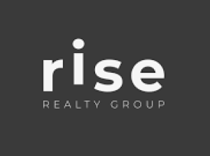
Located in Brantford, Ontario, and with a 5-star average rating on Google, Rise Realty Group has one of those logos where you look at it and go “Oh, I get it!”
As you can see, the “i” is rising up slightly above the rest of the letters, and that, in itself, gives us a small rush of endorphins, as we managed to solve a small visual puzzle.
Rise seems to be a very openly woman-run business, prominently featuring several boss babes that are featured on both their website, and their Youtube, among other places, with the logo being consistent throughout.

As we’ve discussed previously, some agencies are connected to larger brands with nationwide brand recognition, but, in this case, Rise seems to be connected to a group called The Real Brokerage, which is a company that has its own branding, and perhaps isn’t as old and as name-recognition ready as C21.
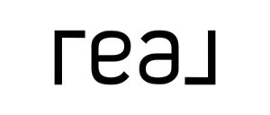
That said, there’s something fairly bold about Rise Realty Group, and its associate company, Real, that would seem to suggest a fresh new spin on real estate, if we were to make a guess from their rather modern, stylish branding. Definitely ones to watch!
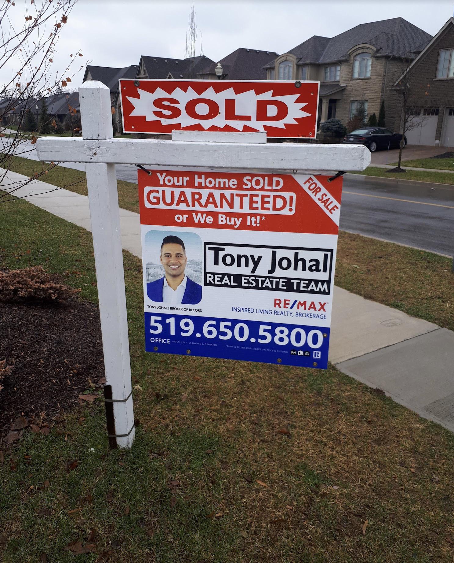
Tony Johal Real Estate Agent & Team
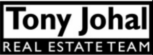
Being from the KW region, we are more aware of Tony Johal from his smiling face than from his logo, per se, but if we were to say something upfront about his logo, it would be that it’s understated, not flashy.
This almost sounds like we’re saying it’s boring, but you have to admit, it’s not as if it’s overly fancy, right?

Then again, when you start seeing it in different places, like his website, or elsewhere on the web, it starts to have a certain appeal because it takes on a more utilitarian feel.
Or maybe a better way to put it is, in contrast to the website, which has a very nice “hero” image, the logo stands out very starkly, with the black and white really popping on the colourful background.
To us, once you see it a few times this rather functional logo starts to take on the message of wanting to stick to the task at hand, which makes us think that this is going to be a REALTOR® that is focused on the work, and working for his client, rather than being distracted by other things.
So that, in a nutshell, is what we get from this logo. At first, it’s rather plain. Then, as you see it used more on different images, coupled with the RE/MAX | TwinCity logo, which has that big name recognition and more primary but also strategically placed colours, you start to see how Tony’s logo has the ability to pop out against other backgrounds.

Overall, very cool!
Conclusion
As we wrap up our analysis of real estate logos from the Waterloo Region and beyond, it’s clear that design plays a crucial role in branding within this competitive market.
From the artistic flair of Real Home Experts to the bold and modern approach of Rise Realty Group, each logo tells a unique story about its associated business.
Whether it’s the visual appeal and consistency of Keller Williams Innovation Realty, the classic and trusted presence of CENTURY 21 CANADA, or the understated yet effective branding of Tony Johal Real Estate, these logos serve as an essential element of each REALTOR®’s identity.
The effectiveness of a logo isn’t solely in its design but also in how well it communicates the values and personality of the business it represents.
As we’ve explored, successful logos not only enhance brand recognition but also convey professionalism, reliability, and a distinct market presence.
In this dynamic landscape, understanding and appreciating the nuances of these visual identities can offer valuable insights into the broader trends and strategies employed in real estate marketing.
We hope this analysis has provided both a thoughtful and entertaining look at the logos shaping the real estate market in our region.
Remember, whether you’re a REALTOR® or a business owner in any field, your logo is more than just a graphic—it’s a powerful tool for making a memorable impression and connecting with your audience.
![]()
Call or Text Starscape SEO: (519) 208-8680