
In the competitive world of business, a logo can be a company’s most valuable asset—or its undoing.
While many factors contribute to a business’s success or failure, a bad logo can seriously harm a brand’s image, alienate customers, and, in some unfortunate cases, be a catalyst for a company’s downfall.
Let’s delve into some intriguing stories of businesses that saw their fortunes crumble, at least in part, due to disastrous logo choices.
These tales are filled with juicy gossip, surprising turns, and cautionary lessons for all.
The Tale of Tropicana: When Fresh Branding Goes Sour
In 2009, Tropicana, a well-known orange juice brand, decided it was time for a fresh squeeze on their branding.
They unveiled a new logo and packaging, ditching their iconic orange-with-a-straw image in favor of a more minimalist design.
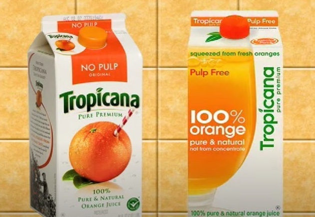
The new logo featured a plain glass of orange juice, with the Tropicana name written in a sans-serif font. It seemed like a straightforward update, but it turned out to be a branding disaster.
Consumers were baffled and outraged by the change.
The iconic image of the orange, which had symbolized freshness and quality for decades, was gone.
The new design was criticized for being generic and uninspiring. Sales plummeted by 20% in just a few weeks, resulting in a loss of approximately $30 million.
Tropicana quickly reverted to the original packaging, but the damage was done. The failed rebrand became a classic example of how a bad logo and packaging redesign can tank a business’s market share, at least temporarily.
The Gap’s Gap: A Logo That Just Didn’t Fit
In 2010, Gap, the popular clothing retailer, decided to update its classic logo.
The original logo, with its distinctive blue square and bold white font, was swapped for a simpler design with Helvetica font and a small, gradient blue box.
![]()
The reaction was swift and brutal.
Fans of the brand were horrified by the change, describing the new logo as cheap and uninspired.
It lacked the distinctive character of the original and seemed like a downgrade rather than an upgrade.
The backlash was so intense that within a week, Gap announced it would revert to the old logo.
The botched rebranding attempt became a public relations nightmare and exposed a gap in the company’s understanding of its own brand identity.
The logo fiasco cost the company both financially and reputationally, as it revealed a disconnect between the brand and its loyal customers.
While Gap survived, the episode remains a textbook example of how not to handle a logo redesign.
Toys “R” Us: A Logo Lost in Translation
Toys “R” Us was once the go-to destination for children’s toys and games.
However, as the retail giant struggled to compete with online retailers and big-box stores, they decided a logo update might rejuvenate their brand.
In 2007, the company introduced a redesigned logo, featuring a softer, more childlike font and a star replacing the backwards “R.” The intention was to create a more whimsical and child-friendly image.
![]()
Unfortunately, the new logo didn’t resonate with consumers. The playful design failed to convey the reliability and variety that customers expected from the brand.
The change coincided with a broader decline in brick-and-mortar toy sales, and Toys “R” Us ultimately filed for bankruptcy in 2017.
While the logo redesign was not the sole reason for the company’s collapse, it symbolized a broader failure to adapt and resonate with a changing market. The logo change became a minor but telling footnote in the saga of a beloved brand’s decline.
Airbnb: From Aesthetic to Aesthetic Disaster
Airbnb has grown into a global phenomenon, but not without its share of branding controversies.
In 2014, the company unveiled a new logo, known as the “Bélo,” intended to represent belonging and community.
The symbol was an abstract combination of a heart, a location pin, and the letter “A.”
![]()
However, the logo’s design immediately sparked ridicule and confusion. Many saw it as resembling various unrelated objects, and some even pointed out its unfortunate resemblance to body parts, leading to a wave of online mockery.
While Airbnb managed to weather the storm thanks to its strong market position and continued growth, the logo fiasco was a significant misstep.
It highlighted the importance of thorough testing and consideration of public perception before rolling out a new brand identity.
The logo, despite its initial reception, has since become widely recognized, but the episode serves as a reminder of the potential pitfalls in logo design.
London’s Olympic Logo: A Costly Controversy
The 2012 London Olympics logo, designed by Wolff Olins, was revealed to mixed reactions, with some praising its boldness and others criticizing it as confusing and unattractive.
The design featured a jagged, abstract representation of the numbers “2012,” with bright, clashing colors. The logo, which reportedly cost £400,000, was met with widespread ridicule. Critics called it “childish,” “ugly,” and even “distracting.”
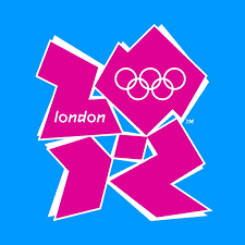
Despite the criticism, the logo became synonymous with the London Games.
However, it also became a cautionary tale about the importance of public perception in logo design, especially for high-profile events.
The controversy didn’t tank the Olympics, but it was a costly lesson in branding missteps that left a lasting impression on both designers and the public.
Conclusion: The Power and Peril of Logos

These stories of failed logos remind us that a logo is more than just a visual mark; it embodies a company’s identity, values, and relationship with its audience.
A bad logo can lead to confusion, alienation, and even a decline in sales, as these examples illustrate.
However, they also show that while a logo can play a significant role in a company’s success or failure, it is not the sole factor.
Brands can recover from bad logos with quick action, a strong brand identity, and a loyal customer base.
In the end, these tales of logo disasters offer juicy insights into the complexities of branding and the fine line between creativity and calamity.