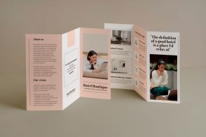
In the world of marketing materials, brochures and flyers often get lumped together as interchangeable tools for promoting a business or event.
And if you want to trigger our head graphic designer, Daniela, go ahead and say they’re the same thing. She’ll shoot you a look that will freeze your soul, and you do not want that! 😕
Now, while they both serve the purpose of delivering information, their design, structure, and usage are distinctly different.
This misconception can drive graphic designers crazy, as the nuances of each format play a crucial role in their effectiveness.
Let’s dive into why brochures and flyers are not the same and why it matters.
Understanding the Basics

Flyers:
Purpose: Flyers are typically used for quick, impactful communication. They are meant to grab attention and convey essential information rapidly.
Design: Flyers are often single-page documents, usually printed on one side (or both), with bold headlines, striking images, and concise copy. They are designed to be visually engaging and easy to digest.
Usage: Flyers are ideal for promoting events, sales, or new products. They are often distributed in high-traffic areas, handed out at events, or inserted into mailboxes.

Brochures:
Purpose: Brochures are designed to provide more detailed information about a business, product, or service. They offer a comprehensive overview, allowing for a deeper understanding.
Design: Brochures are multi-page documents, often folded into sections such as bi-folds or tri-folds. They contain more text, detailed images, and structured layouts to guide the reader through the information.
Usage: Brochures are typically used in settings where potential customers have the time and interest to engage with more in-depth information. They are common in business presentations, trade shows, and as leave-behinds in offices or stores.
Key Differences

Content Density:
Flyers: Short and to the point. The goal is to catch the eye and deliver a quick message.
Brochures: Rich in content. They provide a detailed narrative that educates and informs the reader.
Design Complexity:
Flyers: Simple and bold design elements. The focus is on immediate visual impact.
Brochures: More complex layouts with multiple sections. The design guides the reader through a logical flow of information.
Distribution Method:
Flyers: Widely distributed in public spaces, often as a quick handout or insert.
Brochures: Targeted distribution to interested parties, often given in more formal settings.
Durability:
Flyers: Designed for short-term use, often discarded after the event or promotion.
Brochures: Meant to be kept and referred to multiple times, providing lasting information.
Why the Distinction Matters

Understanding the difference between brochures and flyers is crucial for effective marketing.
Using the wrong format can undermine your message and reduce the impact of your campaign. Here’s why it matters:
Message Delivery: A flyer’s brevity won’t suffice if you need to explain a complex product. Conversely, a brochure’s detailed content may overwhelm someone just looking for a quick overview.
Design Approach: Graphic designers tailor their approach based on the format. Mixing up the two can lead to design inefficiencies and a final product that doesn’t meet its objective.
Cost Efficiency: Printing costs vary significantly between single-page flyers and multi-page brochures. Knowing which format suits your needs helps in budgeting effectively.
Conclusion
Brochures and flyers are distinct tools in the marketer’s arsenal, each with its own set of strengths and applications.
While they might seem similar at a glance, understanding their differences is key to leveraging their potential.
Respect these differences, and your graphic designer will thank you, ensuring your marketing materials are both beautiful and effective.

