
Hi, Dave Fox here from Starscape SEO. As you might have noticed if you’re a web developer, this site does indeed use Elementor to build some of its pages.
Specifically, I want to hop into the wide world of Elementor layout models, as they are extremely handy in web design projects of all sorts.
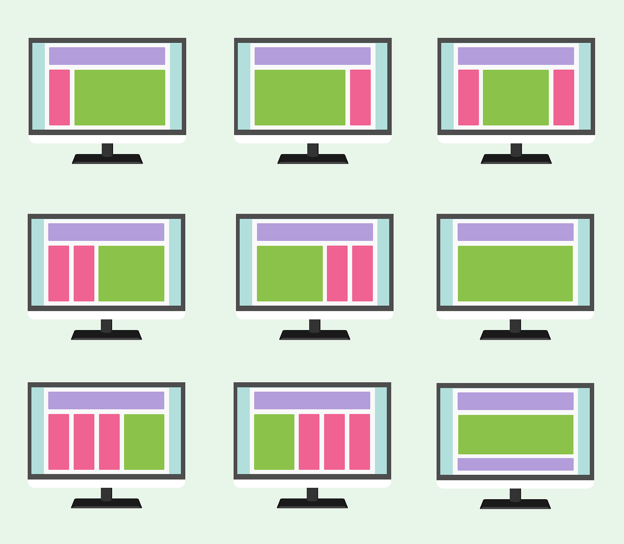
Elementor integrates several layout modules to help create responsive and flexible web designs. Here’s a breakdown of the layout modules that are part of or compatible with Elementor:
Table of Contents
ToggleFlexbox (Flexible Box Layout)
Elementor Integration: Elementor incorporates Flexbox within its Container elements, enabling users to create flexible, responsive layouts. The Flexbox model allows users to align, order, and distribute space among elements within a container.
Use in Elementor: Aligning items, distributing space, and handling complex responsive behaviors like columns and rows.
CSS Grid
Elementor Integration: While Elementor doesn’t offer native drag-and-drop support for CSS Grid in the same way it does for Flexbox, it is possible to apply CSS Grid manually using the “Custom CSS” feature in the Pro version. However, it’s not as intuitive as Flexbox, which has a more direct integration.
Use in Elementor: Advanced layouts for users comfortable with CSS. You can manually define rows, columns, and grid areas with custom CSS.
CSS Positioning (Relative, Absolute, Fixed, Sticky)
Elementor Integration: Elementor offers comprehensive support for CSS positioning through its Advanced Tab. Users can set elements to be positioned relatively, absolutely, or fixed on the page.
Use in Elementor: Commonly used for sticky headers, floating elements, or precisely positioning certain elements relative to the page or section.
CSS Display: Inline-Block
Elementor Integration: Elementor uses block and inline-block display properties for basic layout functionality, especially when managing text and button elements.
Use in Elementor: Organizing elements horizontally or vertically without full grid or Flexbox structure.
CSS Multi-Column Layout (CSS Columns)
Elementor Integration: Elementor offers basic multi-column layouts directly through its Columns feature.
However, it does not provide a deep integration with CSS Multi-column Layout (for flowing text into multiple columns). Instead, Elementor handles columns via Flexbox or block-level containers.
Use in Elementor: Used to divide sections into multiple columns, especially for content blocks like text or images.
CSS Floats
Elementor Integration: While floats are less commonly used in modern designs, Elementor does not use floats directly for layout purposes. It relies more on Flexbox for handling responsive design and layout alignment.
Use in Elementor: Not generally used within Elementor’s layout system, though older float-based elements may still work.
Custom CSS
Elementor Pro Only: For advanced users who want to apply custom CSS, Elementor Pro provides a “Custom CSS” feature that allows you to apply any layout technique, such as CSS Grid, Floats, or even more experimental methods like CSS Regions.
Use in Elementor: This allows users to enhance Elementor’s built-in layout systems with additional or more complex custom layouts.
Summary of Layout Modules in Elementor
Flexbox: Fully integrated with Elementor’s Container system for building responsive layouts.
CSS Grid: Supported via Custom CSS, but not natively integrated with a visual interface.
Positioning: Fully integrated, offering options for absolute, fixed, relative, and sticky positioning.
Inline-Block: Used for simpler elements like buttons and text alignment.
Multi-Column Layout: Handled primarily through Elementor’s column system (via Flexbox).
Floats: Not actively used by Elementor, as Flexbox and Grid have replaced its primary use cases.
Elementor’s built-in flexibility mainly revolves around Flexbox for responsive, adaptable layouts, while advanced users can integrate CSS Grid and other layout techniques through custom CSS.
Call or Text Starscape SEO: (519) 208-8680