

Hi, Dave Fox here from Starscape SEO. In the ever-evolving world of digital marketing, responsive web design has emerged as a critical factor in determining a website’s success.
With the growing diversity of devices used to access the internet—from desktops and laptops to smartphones and tablets—ensuring that your website looks and functions optimally across all screen sizes is no longer just a nice-to-have; it’s a necessity.
But how does responsive web design impact SEO?
Let’s dive into the relationship between responsive design and search engine optimization (SEO) and explore why this approach is crucial for your website’s visibility and ranking.
What is Responsive Web Design?
Responsive web design (RWD) is a web development approach that creates a seamless user experience by ensuring a website adapts to various screen sizes and device orientations.

Rather than creating separate versions of a site for desktop and mobile users, responsive design uses flexible layouts, images, and cascading style sheets (CSS) to adjust content dynamically based on the device accessing it.
This adaptability means users can enjoy a consistent experience whether they’re browsing on a smartphone, tablet, or desktop computer.
The SEO Impact of Responsive Web Design
Improved User Experience and Lower Bounce Rates
User experience (UX) is a key factor in SEO.
Search engines like Google prioritize websites that offer a positive user experience, and a responsive design ensures that your site is accessible and easy to navigate on any device.
When users land on a site that is difficult to navigate or slow to load on their device, they’re likely to leave quickly, leading to a high bounce rate.
High bounce rates can signal to search engines that your site isn’t providing valuable content or a satisfactory user experience, which can negatively impact your rankings.
With responsive design, your content automatically adjusts to fit the screen, ensuring readability and ease of navigation.

This helps keep users on your site longer, reducing bounce rates and increasing the chances of conversions—whether that means making a purchase, filling out a contact form, or reading more of your content.
The longer users stay engaged with your site, the more favorable signals you send to search engines, ultimately boosting your SEO performance.
Unified Website URL Structure
One of the key benefits of responsive web design is that it eliminates the need for separate mobile and desktop versions of your website.
In the past, businesses often created a mobile-specific version of their site with a different URL (e.g., “m.example.com”).
While this approach did provide a mobile-friendly experience, it also created challenges for SEO.
With separate URLs, you end up splitting your traffic and backlinks between the mobile and desktop versions of your site, which can dilute your SEO efforts.
Responsive web design, on the other hand, uses a single URL for both desktop and mobile versions, consolidating your SEO power into one unified structure.
This means all your traffic and backlinks contribute to the same site, improving your domain authority and making it easier for search engines to crawl and index your content.
Faster Page Load Times
Page speed is a critical ranking factor for SEO, and responsive web design can play a significant role in improving your site’s load times, particularly on mobile devices.
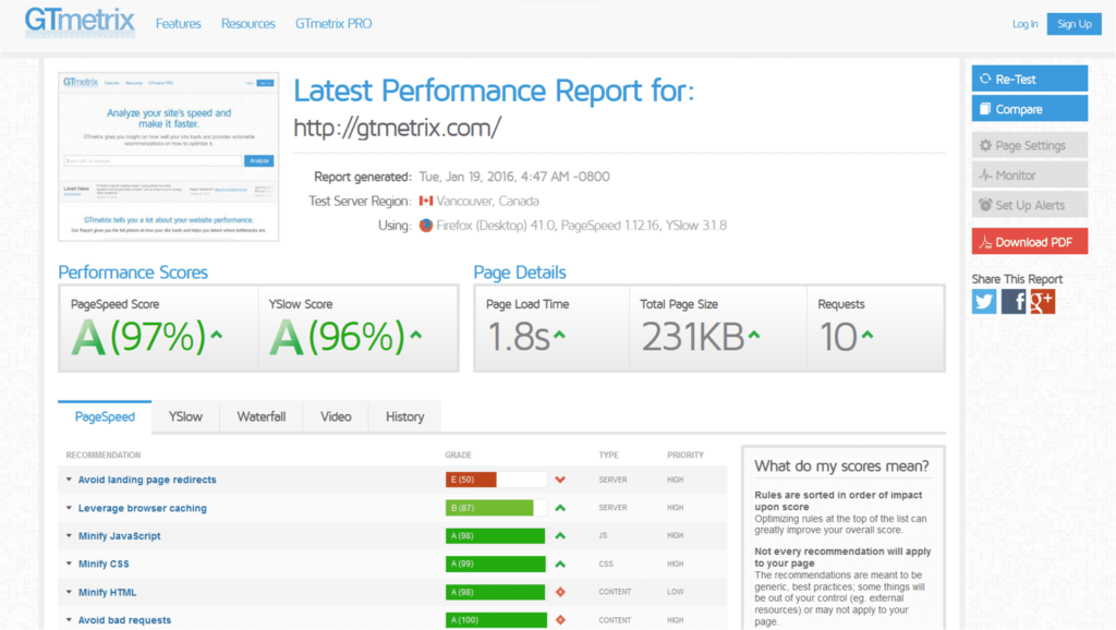
A responsive design allows you to optimize images, reduce unnecessary code, and prioritize above-the-fold content, ensuring that your site loads quickly regardless of the device being used.
Slow-loading pages frustrate users and lead to higher bounce rates, which can hurt your SEO performance.
Google has been vocal about the importance of page speed, especially on mobile devices, and sites that load quickly are more likely to rank higher in search results.
By implementing responsive design, you can streamline your site’s performance, providing a faster, more efficient experience that keeps users engaged and boosts your search rankings.
Mobile-First Indexing Compatibility
As mobile internet usage has surpassed desktop usage, Google has shifted to mobile-first indexing.
This means that Google primarily uses the mobile version of your site for indexing and ranking purposes. If your site isn’t mobile-friendly, it could suffer in search rankings, even if the desktop version is optimized.
Responsive web design is inherently compatible with mobile-first indexing because it ensures that your site is optimized for mobile users by default.
This alignment with Google’s indexing strategy helps secure better rankings in search engine results pages (SERPs), driving more organic traffic to your site.
Enhanced Social Sharing
Social signals, while not a direct ranking factor, can influence your SEO by increasing your site’s visibility and driving traffic.
When your site is responsive, it’s easier for users to share your content across various social media platforms, regardless of the device they’re using.

A well-designed responsive site ensures that shared content displays correctly on all devices, encouraging more social interactions and potentially boosting your site’s authority in the eyes of search engines.
Conclusion
Responsive web design is more than just a trend—it’s a fundamental component of modern SEO.
By improving user experience, streamlining your URL structure, speeding up page load times, aligning with mobile-first indexing, and enhancing social sharing, responsive design directly impacts your site’s ability to rank well in search engines.
In a world where users expect a seamless browsing experience across all devices, implementing responsive web design is essential for maintaining a competitive edge in the digital marketplace.
For more insights on how to optimize your website for SEO success, stay tuned to our blog or get in touch with us at Starscape SEO.
Call or Text Starscape SEO: (519) 208-8680