Affinity Real Estate
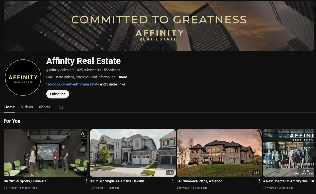
Located at 675 Riverbend Dr, Kitchener, Ontario, Affinity Real Estate, working under the eXp Realty, Brokerage banner, seems to have everything in order here. Let’s run down what’s working.
Now, keep in mind, in this browser, we are looking at the “Dark” theme, so this screen can also be viewed in a “Light” theme as well, giving it an entirely different look. Here’s a peek at that:
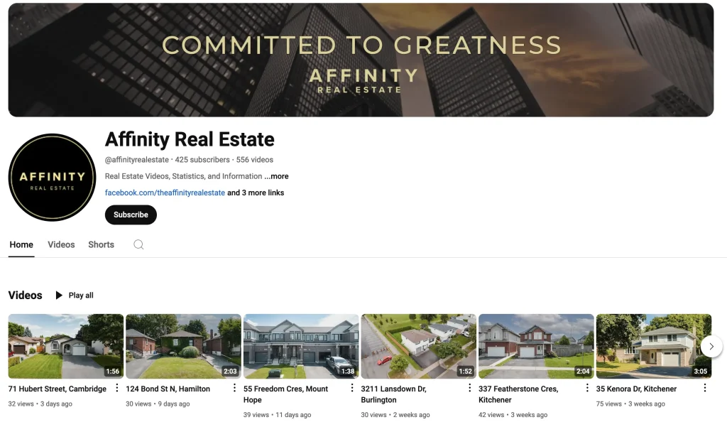
It’s worth noting that this is controlled by the user, not by the Youtuber. You, as a viewer, select the Dark or the Light theme, depending on your preference. The Dark theme, at least with Affinity Real Estate, is what we prefer, but it’s just a matter of taste. They both look good, actually.
The size of the channel, interestingly, isn’t what jumps out right away to us. The banner, the logo, and the video thumbnails all jump out first, and they all look great, even at a glance.
The design chops of this team is obviously on point. They know their colour swatches, the know design principles, they know what makes thumbnail look pleasing to the eye.
Beyond that, they have their @ handle customized, as you can see under the page’s title, they have a brief description that’s on topic, and they’ve added some links. We could go on with these fine folks, but let’s keep this train moving right along…
Rego Team
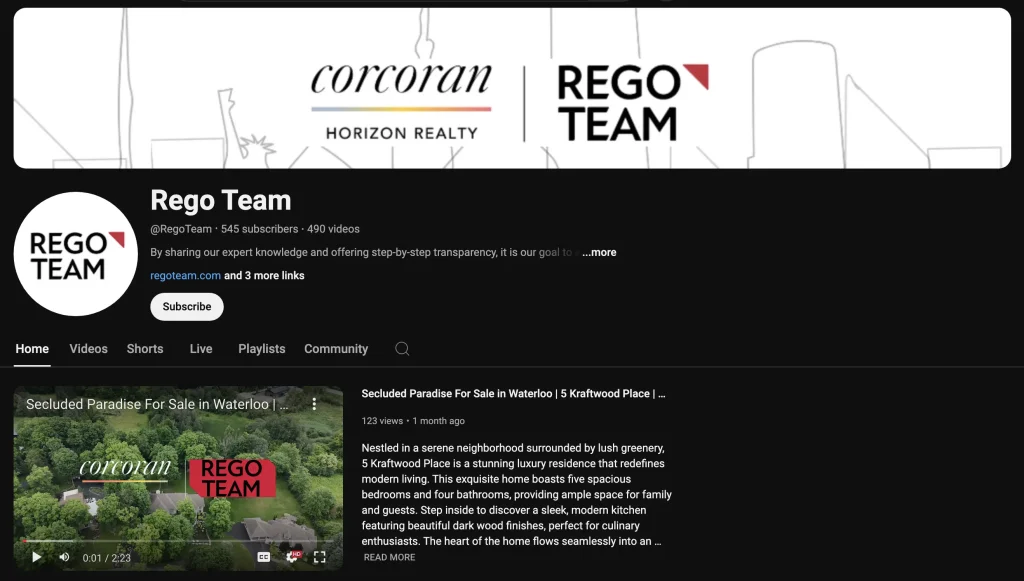
Located at 618 King St W, Kitchener, Ontario, the Rego Team, headed by Cliff Rego, is well known in Waterloo Region, but how do they stack up on Youtube?
The thing about many businesses when it comes to Youtube, is they either don’t have a Youtube channel, they have a channel and it’s undercooked (not much on it, no one working on it), or it’s got it’s sh*t together.
In the case of the Rego Team, we’d say that this is yet another REALTOR® who knows what they’re doing when it comes to Youtube. How do we know?
Well, just like the Affinity team we just discussed, all of the main Youtube channel stuff is done.
They have a banner, they have a logo, they have – in this case – a featured video, which is an option you can choose when displaying the page to new or returning visitors (ie. have a specific video pop up).
The Rego Team also has their website listed and linked, they have their @ handle customized, and they have a channel description that sounds inviting and conversational (perhaps moreso than the previous team).
How will this benefit Cliff Rego and team? It can drive traffic to his website, it can act as it’s own little mini Netflix for the brand.
It can be anything they want it to be. This is only possible when they get the essentials in line, which they have. Who’s next?
TrilliumWest Real Estate Brokerage
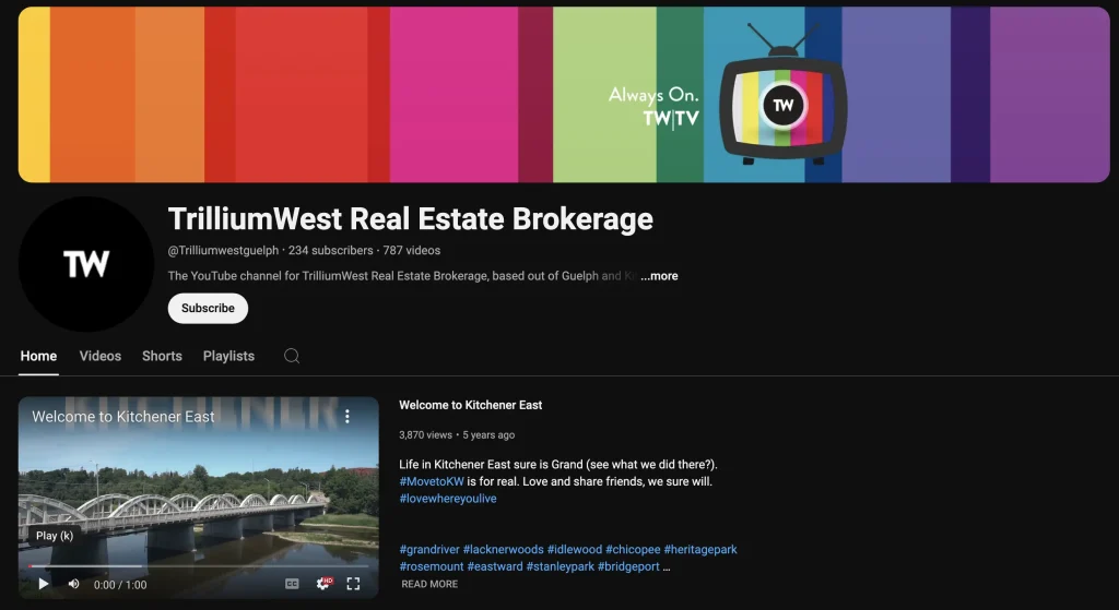
Located at 240 Duke St W, Kitchener, Ontario, TrilliumWest Real Estate Brokerage is another good example of a Youtube channel that knows what it’s doing.
You’ll notice, in this case, that they treat this like it’s a TV station, with a banner that reflects that. It’s almost like you’re watching Hulu Plus, with some kind of cute station ID banner at the top.
This thematic choice is one thing, along with a few other factors, that sets this Youtube channel apart slight from the others seen thus far.
You’ll also notice that the main video, which, once again, is selected to be the featured video when you arrive at this page – that video is a Welcome video, and it provides an introduction to living in the Kitchener area. Pretty cool move!
We also see some hashtags, relevant to the video and strategically placed in the video description, not to mention a large view count on this particular video, which is, for certain people browsing, a bit of a flex.
On top of all this, the logo is in place, the @ symbol is there once again, and the video description is ready to rock ‘n roll. Nice work all round.
It should also perhaps be mentioned at this juncture that there is only so much customization that the channel owner can do before they can’t do much else. There’s no control over the page layout, as you might have with a website.
Youtube channels only allow for a certain amount of flexibility, but, within those parameters, there are quite a few small details that can be polished up.
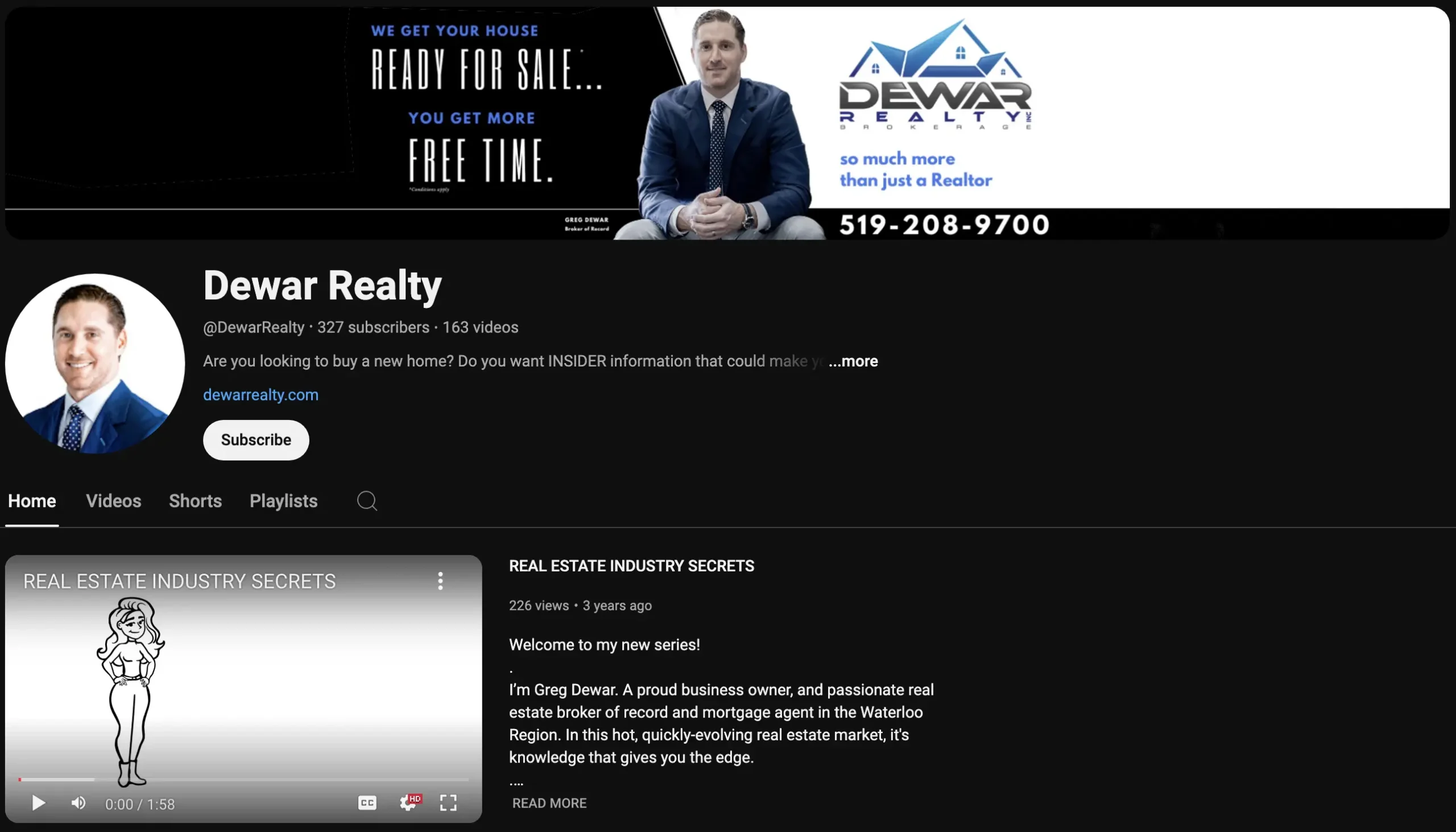
Dewar Realty Inc.
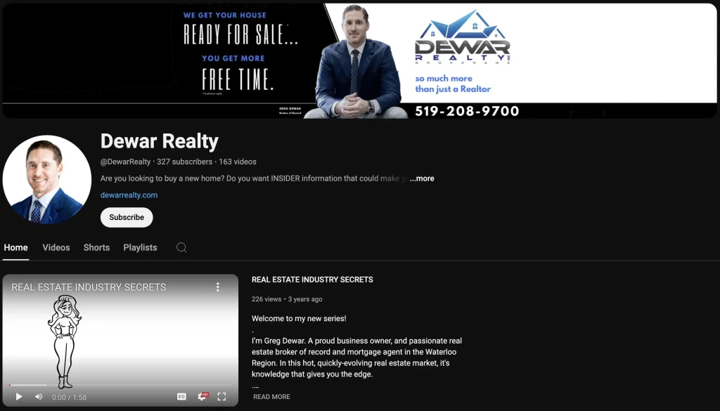
Next we have Dewar Realty Inc., located at 18 Tannery St E, Cambridge, Ontario, and let us ask you – can you see anything different about this one as compared to the previous?
If you answered “no, it looks the same”, that’s more or less true, because it has the @ handle, the website, the feature video, the banner at the top, and the logo.
Everything looks about right, but if we wanted to talk about what is a little different than the previous examples, we could point to the fact that the logo is just a picture of Greg Dewar himself, and not a logo.
The logo resides up in the banner area, along with a phone number, his name in small print, the logo with its custom text, and then the text on the left side which is a bit of a slogan.
Well, it’s about time we provided some critique as we’ve been fairly lenient up until now, so don’t mind us as we sink our marketing teeth into some things that seem a bit “off”, arguably.
What’s with the banner having three different shades of blue in it?
The logo, with its stylized home, is one blue (with a computer gradient as well), while the catch phrase below it, “so much more than just a Realtor” is a different blue, and “so” is in lower case, while on the opposite side of the banner, the other slogan is a different blue again, and then it has some very small text that we can’t read.
Anyway, the banner just seems rather busy, don’t you think? Also, his suit in the logo looks like yet another shade of blue, and the suit in the banner is ANOTHER shade of blue, and the link to his website is YET ANOTHER shade of blue. So that’s like 7 shades or types of blue.
Other than that, at least his page is customized and shows genuine effort put forth.
The Cindy Cody Team
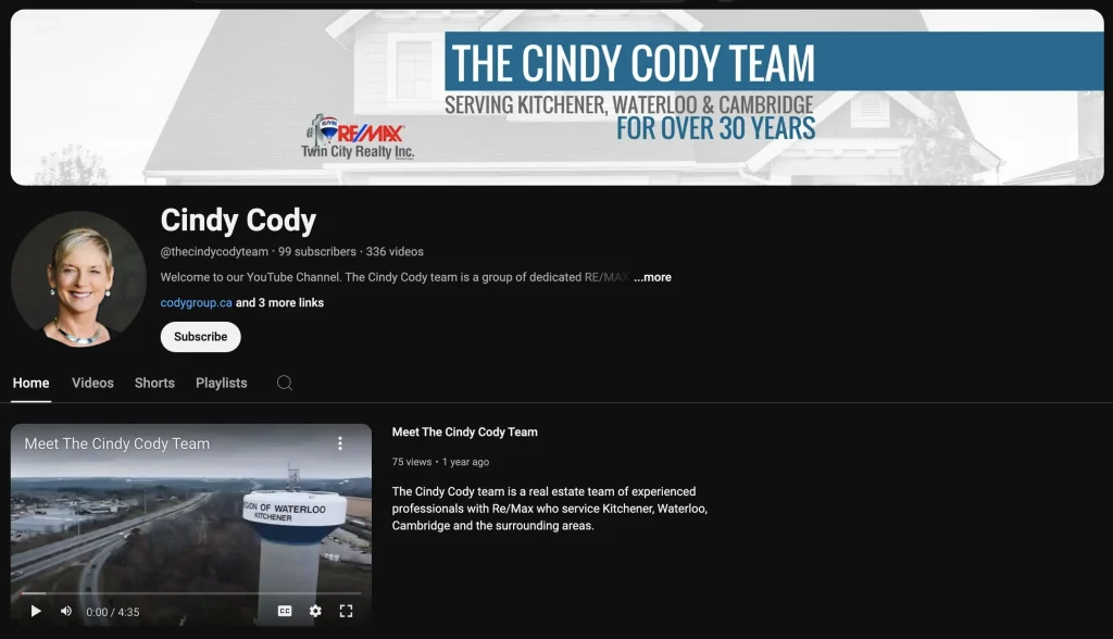
Ok, this is the final one for now! We’ll be back again in Part 2 at a later time…so we’re capping it off with The Cindy Cody Team, who are located at 901 Victoria St N, Kitchener, Ontario.
Let’s look at what’s different this time around, and then we’ll talk about what’s the same as the previous examples, not to mention if we see any glaring problems, even though we know the phrase – “judge not lest ye be judged!” Yeah, karma can get ya! We know!
What’s different is that we can see the RE/MAX logo up there in the banner. We haven’t seen any thus far where the parent company is featured on the Youtube page, if any of the others even have a parent brokerage that they work under. Have not seen it!
We have a “Meet The Cindy Cody Team” video as the introductory video to the page, which also mentions RE/MAX and the fact that it’s a team of experienced professionals.
So far so different, as is the fact that we see a message of serving for over 30 years. Haven’t seen that yet either, have we? At least, not in this article.
They also say what areas they serve, up in the banner, which is helpful. Another minor twist to consider.
Still, some things are the same, in a good way. We’re talking about the custom banner, the custom @ handle, the website link, the “Welcome to our Youtube Channel” message. All very professional, friendly, and inviting.
These days, it’s nice to know who is emphasizing a warm, inviting feeling, and who isn’t really concerned with making you feel too comfortable. We prefer to be showered with warm greetings, ourselves.
Conclusion
Thanks for joining us on this first leg of our journey through the YouTube pages of Kitchener-Waterloo REALTORS®.
We’ve explored some standout home pages, from Affinity Real Estate’s design-savvy approach to The Cindy Cody Team’s emphasis on experience and professionalism.
It’s clear that these professionals understand the importance of a polished online presence, and we’ve enjoyed breaking down what’s working—and where there might be room for improvement.
Remember, this is just the beginning.
We’ll continue our casual Fridays-style analysis in the next installment, so stay tuned as we delve into more YouTube channels and discover how KW REALTORS® are using this platform to connect with their audience.
Whether you’re looking for inspiration or just along for the ride, we hope you found this exploration as fun and informative as we did. See you next time!

Call or Text Starscape SEO: (519) 208-8680
