

In the world of branding and design, a logo is often considered the cornerstone of a company’s identity.
A well-designed logo can enhance brand recognition, convey the essence of a business, and attract customers.
However, not all successful logos adhere to traditional design principles or aesthetic appeal.
Some logos have been criticized as weird, wacky, or downright ugly, yet they have still managed to become iconic and contribute to their company’s success.
In this article, we’ll explore some of the most unusual logos that, despite their unconventional designs, have worked wonders for their brands.
Comic Sans and the eBay Logo
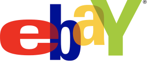
When eBay unveiled its logo in 1995, it featured a colorful, playful design with overlapping letters in a jumbled arrangement.
The font choice resembled Comic Sans, a typeface often criticized for its amateurish appearance. Despite—or perhaps because of—its unpolished look, the logo captured the essence of eBay’s diverse and eclectic marketplace.
The quirky design conveyed a sense of fun and approachability, resonating with users who appreciated the platform’s informal and inclusive vibe.
Over the years, the logo became synonymous with the eBay brand, helping the company become a dominant player in online auctions and e-commerce.
Microsoft’s Original Windows Logo
Microsoft’s original Windows logo, introduced in 1985, was a simple, pixelated representation of a window with sea blue panes.
The design was criticized for its basic and rudimentary appearance, reminiscent of early computer graphics.
Despite its unrefined look, the logo became emblematic of the company’s groundbreaking software, representing a gateway to a new era of personal computing.
The Windows logo’s simplicity and familiarity played a significant role in making it one of the most recognizable symbols in technology history.
London 2012 Olympics Logo
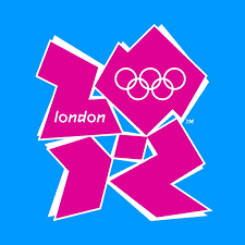
The logo for the London 2012 Olympics faced widespread criticism and controversy upon its unveiling.
The design featured a jagged, abstract representation of the number “2012” in bright, bold colors.
Many people found the logo to be chaotic, confusing, and even unpleasant to look at.
However, the unconventional design achieved its goal of creating a distinctive and memorable identity for the event.
The logo’s boldness and uniqueness sparked conversation and debate, making it a topic of public discussion and ensuring widespread recognition.
Despite the initial backlash, the logo became an integral part of the London Olympics’ branding and marketing.
The Ugly Duckling of Fashion: The Supreme Box Logo
The logo of the streetwear brand Supreme is remarkably simple: a red rectangle with the word “Supreme” in white Futura font.
While not traditionally “ugly,” the logo’s simplicity and lack of ornamentation have been criticized as unimaginative and basic.
However, this minimalist design has become a cultural phenomenon, synonymous with exclusivity and hype in the fashion world.
Supreme’s use of the logo on limited-edition products has created a cult-like following, with fans eagerly waiting for new releases and paying premium prices for items featuring the logo.
The Heinz Ketchup Logo
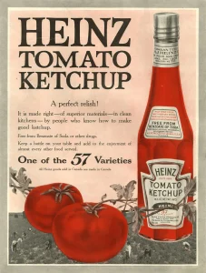
The Heinz ketchup logo, featuring the company’s name in a stylized script above an iconic keystone shape, has been a staple in households worldwide for decades.
However, the design is not particularly striking or aesthetically pleasing.
Some have even described it as bland or old-fashioned. Despite this, the Heinz logo has become a powerful symbol of quality and reliability.
Its ubiquity and consistency have made it instantly recognizable, helping Heinz maintain its position as a leading brand in the condiment market.
The Google Doodle Variations
![]()
Google’s logo is simple and straightforward, consisting of the company’s name in a sans-serif font with a playful color scheme.
However, Google’s “Doodle” variations—temporary changes to the logo to celebrate holidays, events, or notable figures—have been both praised and criticized.
Some doodles are intricate and artistic, while others have been described as awkward or unappealing.
Despite this, the Google Doodle has become a beloved feature, adding an element of surprise and delight to the user experience.
It reflects the company’s playful and innovative spirit, reinforcing Google’s brand identity.
The Pepsi Globe (2008 Redesign)
![]()
Pepsi’s 2008 logo redesign introduced a new version of the iconic Pepsi globe, with a wavy white band that many found perplexing and unattractive.
Critics argued that the design lacked symmetry and looked odd compared to previous iterations.
Despite these criticisms, the new logo marked a successful rebranding effort that aligned with Pepsi’s modern and dynamic image.
The redesigned logo has since become widely recognized, demonstrating that even controversial changes can resonate with audiences and contribute to a brand’s evolution.
Conclusion
The world of logo design is subjective, and what one person finds unattractive, another may see as unique or memorable.
The logos discussed in this article demonstrate that traditional notions of beauty and design are not always necessary for success.
In some cases, a logo’s effectiveness lies in its distinctiveness, ability to spark conversation, or alignment with a brand’s identity and values.
Whether celebrated or criticized, these unconventional logos have all contributed to their companies’ success, proving that sometimes, being different can be a powerful asset in the world of branding.