

Hi, Dave Fox here from Starscape SEO. In our increasingly connected world, mobile devices have become an essential part of daily life.
From checking emails and social media to shopping online and consuming news, people rely on their smartphones and tablets for almost every aspect of their digital existence.
For businesses, this shift in consumer behavior has made it imperative to ensure their websites are optimized for mobile users.
A mobile-friendly website is not only a necessity for providing a good user experience, but it also significantly impacts search engine rankings, traffic, and conversions.
Understanding Mobile-Friendliness
A mobile-friendly website is designed to be easily viewed and navigated on smaller screens like smartphones and tablets.

This means the website should load quickly, be easy to read, and have a layout that automatically adjusts to fit different screen sizes.
A well-optimized mobile website ensures that users don’t have to zoom in to read text or struggle to click on tiny buttons.
Why Mobile-Friendliness is Crucial for Businesses
There are several key reasons why mobile-friendliness is essential for any business:
Improved User Experience
Today’s consumers expect a seamless browsing experience regardless of the device they use.

Websites that are easy to navigate and load quickly on mobile devices are more likely to engage users, encouraging them to stay longer and explore more pages.
Conversely, websites that are difficult to use on mobile devices can lead to frustration, causing users to leave and seek out competitors.
Higher Search Engine Rankings
Search engines like Google have made mobile-friendliness a significant factor in their ranking algorithms.
In 2015, Google rolled out its “Mobilegeddon” update, which prioritized mobile-friendly websites in search results.
This means that a website that is optimized for mobile devices is more likely to rank higher on search engine results pages (SERPs), thereby reaching a broader audience and potentially driving more organic traffic.
Increased Conversions
A mobile-friendly website is more likely to convert visitors into customers.
If a user can easily navigate a site and quickly find what they’re looking for, they are more likely to complete a purchase or fill out a contact form.
In fact, studies have shown that users are more likely to abandon a website if it isn’t optimized for mobile, leading to lost sales and missed opportunities.
Enhanced Brand Reputation
A mobile-friendly website demonstrates a company’s commitment to providing a positive user experience, which can enhance the brand’s reputation.
In an era where customer experience is a significant differentiator, having a mobile-optimized website signals that your business is modern, responsive, and customer-focused.
Key Elements of a Mobile-Friendly Website
Creating a mobile-friendly website involves more than just ensuring it looks good on smaller screens. Here are the key elements that a mobile-friendly website should include:
Responsive Design
Responsive design is a web design approach that enables a website’s layout to adjust automatically based on the screen size and orientation of the device being used.
This ensures that content is displayed optimally on all devices, from large desktop monitors to small smartphone screens.

Optimized Images
Large images can significantly slow down a website’s loading time, which can be a major issue for mobile users with slower internet connections.
To ensure fast loading times, images should be compressed and optimized without sacrificing quality.
Fast Loading Times
Mobile users tend to have less patience for slow-loading websites.
A delay of even a few seconds can lead to increased bounce rates.
Techniques such as minification (removing unnecessary characters from code) and caching (storing frequently accessed data for quicker retrieval) can help improve a website’s loading speed.
Easy Navigation
Navigation should be intuitive and straightforward, with menus and links that are easy to access on smaller screens.
This might mean simplifying the navigation bar or using collapsible menus that can be expanded or contracted with a tap.
Touch-Optimized Elements
Interactive elements like buttons and links should be large enough to be easily tapped with a finger.
This reduces the chance of users accidentally clicking the wrong element, which can be frustrating and deter them from staying on the site.
Mobile-Specific Content
Consider tailoring your content to mobile users by creating shorter articles, using bullet points, or incorporating videos.
This approach recognizes that mobile users often have shorter attention spans and may prefer to consume content in bite-sized formats.
Tips for Creating a Mobile-Friendly Website
If you’re looking to optimize your website for mobile devices, here are some practical tips to get you started:
Use a Responsive Design Framework

Frameworks like Bootstrap or Foundation are specifically designed to help create responsive websites.
They provide pre-built components and grid systems that make it easier to ensure your website looks good on all devices.
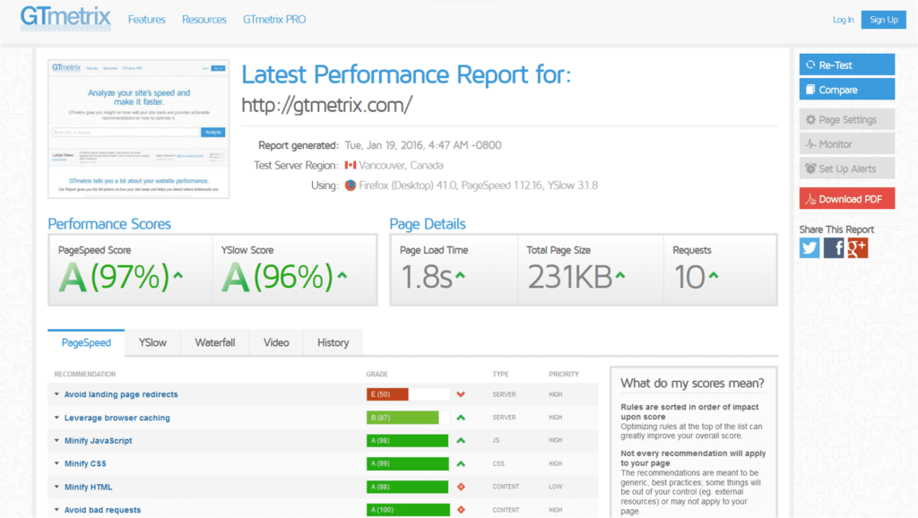
Test Your Website on Different Devices
Testing your website across various devices and screen sizes is crucial to ensure it works as expected on all screens.
There are many tools available, such as Google’s Mobile-Friendly Test and BrowserStack, that allow you to see how your site performs on different devices.
Optimize Images
Use tools like TinyPNG or ImageOptim to compress your images without compromising quality. This will help improve load times and ensure a smoother experience for mobile users.
Minify Your Code
Minifying your HTML, CSS, and JavaScript can reduce file sizes and speed up loading times.
This process removes unnecessary spaces, comments, and characters from the code, making it more efficient for browsers to process.
Use a Content Delivery Network (CDN)
A CDN helps deliver your website’s content faster to users around the world by storing copies of your site on servers in various geographic locations.
This reduces the distance data needs to travel and can significantly improve loading times for users who are far from your main server.
Simplify Your Design
Keeping your website design simple and clean can make it easier for users to navigate and find what they’re looking for.
Avoid clutter, excessive animations, and unnecessary elements that can slow down your site and distract users.
Use Clear and Concise Language
Mobile users may have limited attention spans, so it’s important to convey your message quickly and effectively.
Use clear and concise language and avoid long paragraphs that can be cumbersome to read on smaller screens.
Avoid Flash Content
Flash content is not supported on many mobile devices and can lead to poor user experiences. Instead, use HTML5 or other modern alternatives that are compatible with all devices.
Prioritize Mobile-First Design
Designing with mobile users in mind from the start can help you focus on the most important content and features.
This approach, known as mobile-first design, ensures that your website provides a great experience on mobile devices and can then be adapted for larger screens.
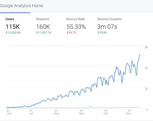
Monitor Mobile Analytics
Use tools like Google Analytics to track user behavior on your mobile website.
Understanding how users interact with your site can help you identify areas for improvement and make data-driven decisions to enhance the mobile experience.
Conclusion
In today’s mobile-first world, having a mobile-friendly website is no longer optional—it’s essential for success.
A well-optimized mobile site improves user experience, boosts search engine rankings, increases conversions, and enhances brand reputation.
By following the tips outlined in this guide, you can create a mobile-friendly website that not only meets the needs of your users but also helps your business reach its full potential.
Prioritizing mobile-friendliness is a smart investment that will pay off in higher traffic, better engagement, and increased sales.
Call or Text Starscape SEO: (519) 208-8680