

Hi, Dave Fox here from Starscape SEO. In today’s digital landscape, having a responsive website is not just an option—it’s a necessity.
With the majority of internet users accessing websites from mobile devices, responsive web design is critical for ensuring your site looks and functions optimally across all screen sizes.
This is especially important in the context of Google’s mobile-first indexing, where the mobile version of your website takes precedence in search rankings.
If you’re a web developer looking to improve your skills or a business owner wanting to ensure your site is mobile-friendly, this article will guide you through five strategies to implement responsive web design.
We’ll start with the basics and work our way to more advanced techniques.
Start with a Responsive Theme
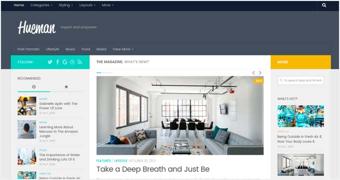
Dead Easy: The most straightforward way to create a responsive website is to start with a responsive theme.
Whether you’re using WordPress, Shopify, Joomla, or any other content management system (CMS), choosing a theme that is inherently responsive saves you from having to retrofit responsiveness into your design later.
Responsive themes are designed to adapt to various screen sizes out of the box.
They come with pre-built layouts that automatically adjust to mobile, tablet, and desktop devices. This ensures that your site is mobile-friendly from the start, providing a seamless user experience across all devices.
Pro Tip: When selecting a responsive theme, look for one that is well-coded, lightweight, and regularly updated.
Poorly coded themes can slow down your site, negatively impacting both user experience and SEO. Before committing to a theme, test it on multiple devices to ensure it performs as expected.
Utilize Responsive Plugins and Add-Ons
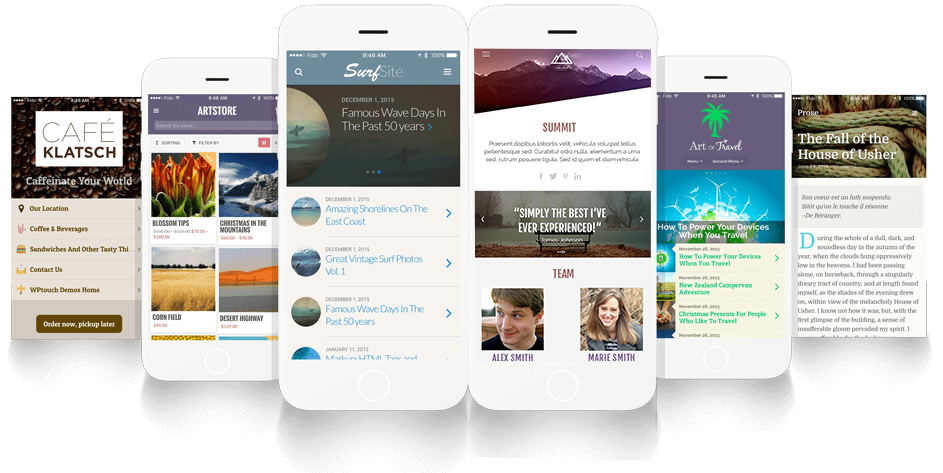
Next Step: If you’ve already got a theme that isn’t fully responsive, or if you want to add more responsive functionality, consider using responsive plugins or add-ons.
These tools can help enhance your site’s adaptability without requiring extensive coding.
For example, WordPress has a variety of plugins designed to improve responsiveness.
Plugins like WPtouch Pro can create a mobile-optimized version of your site, while others like Elementor offer drag-and-drop responsive design features that allow you to tweak your site’s layout for different devices.
Using responsive plugins can be a quick way to fix issues or add features, but be cautious about overloading your site with too many plugins, as this can slow down your site and cause conflicts.
Always test plugins thoroughly to ensure they work well together and maintain your site’s performance.
Implement CSS Media Queries
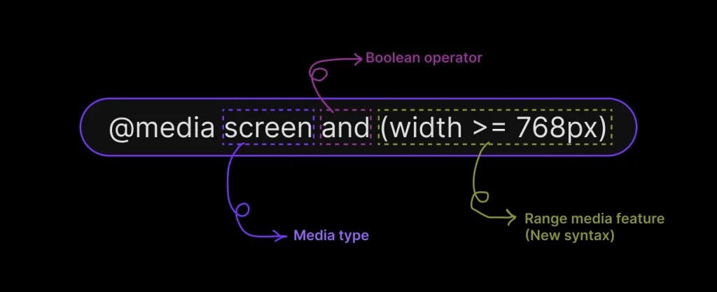
Intermediate: For more control over how your site looks and functions on different devices, dive into the code and use CSS media queries.
Media queries allow you to apply specific styles depending on the device’s screen size, orientation, or resolution.
With media queries, you can create custom layouts that rearrange or resize content to better fit smaller screens.
For example, you might use a media query to hide certain elements on mobile devices or change the font size for improved readability.
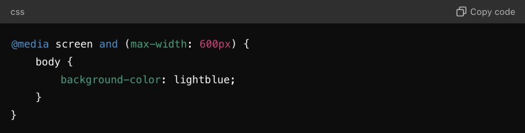
Here’s a simple example of a media query that changes the background color of a site on screens smaller than 600px:
Pro Tip: When using media queries, it’s essential to design mobile-first.
This means starting with the styles for smaller screens and adding styles for larger screens as needed. This approach aligns with Google’s mobile-first indexing and ensures your site is optimized for mobile users.
Use a Flexible Grid Layout
Advanced: A flexible grid layout is a more advanced technique that involves designing your website using a grid system where the layout components are defined as percentages rather than fixed units.
This approach allows your design to be fluid and adjust naturally to various screen sizes.
Popular frameworks like Bootstrap and Foundation offer pre-built grid systems that make it easier to create a responsive layout.
These frameworks use a 12-column grid system, where you can define the width of each element in terms of columns, making your layout flexible and adaptable.
For example, you can set a container to span 6 columns on a desktop and automatically adjust to 12 columns (full width) on a mobile device.
This flexibility ensures your site’s content remains accessible and visually appealing, regardless of the device.
Pro Tip: When using a grid system, ensure that your images, videos, and other media are also flexible.
Use CSS techniques like max-width: 100% to make media elements responsive, so they scale appropriately within the grid.
Optimize for Performance and Speed
Expert: Even the most beautifully designed responsive website can fail if it’s slow to load. Page speed is a crucial factor in both user experience and SEO, particularly with Google’s mobile-first indexing.
To optimize your site’s performance, focus on the following areas:
Image Optimization: Use modern formats like WebP, and compress images to reduce file size without sacrificing quality. Tools like TinyPNG and ImageOptim can help.
Minification: Minify your CSS, JavaScript, and HTML files to reduce load times. Minification removes unnecessary characters, comments, and whitespace from your code.
Lazy Loading: Implement lazy loading for images and videos, so they only load when they come into the user’s viewport. This reduces initial load times and improves performance on mobile devices.
Caching: Use browser caching and Content Delivery Networks (CDNs) to speed up content delivery. Caching stores a copy of your site’s resources, allowing them to load faster on repeat visits.
By focusing on these performance optimizations, you ensure that your responsive website not only looks great on all devices but also loads quickly, providing a superior user experience that search engines reward with higher rankings.
Conclusion

Responsive web design is essential for creating a website that looks and functions well across all devices.
Starting with a responsive theme is the easiest way to ensure mobile-friendliness, but don’t stop there—using plugins, media queries, flexible grids, and performance optimizations will take your site to the next level.
As a web developer who cares about mobile-first indexing and delivering a top-notch user experience, these strategies will help you build a responsive, high-performing site that stands out in search results and keeps your audience engaged.
For more tips and insights on responsive design and SEO, stay tuned to our blog or reach out to Starscape SEO.
Call or Text Starscape SEO: (519) 208-8680