
Hi, Dave here from Starscape SEO.
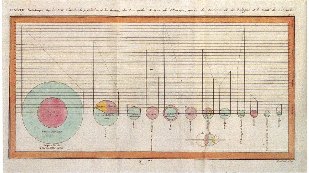
Infographics, rooted in ancient visual communication like cave paintings and hieroglyphics, evolved through the Renaissance with innovations like William Playfair’s bar and pie charts in the late 1700’s.
The term “infographics” gained traction in the late 20th century as digital tools made it easier to create visual data representations.
In the 2020s, infographics have become more interactive and widely used across social media, thanks to advancements in AI and data visualization, making them a key tool for efficiently conveying complex information in the digital age.
What Makes For A Good Infographic?
A good infographic effectively communicates complex information in a visually appealing and easily digestible manner.
Here are the key elements that contribute to a successful infographic:
Clear Objective
Purpose: The infographic should have a clear purpose or message, whether it’s to inform, educate, persuade, or entertain.
Audience: Understand who the target audience is and tailor the content and design to their preferences and knowledge level.
Example:
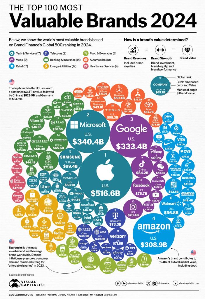
This infographic by Brand Finance, has a clear objective, which is to inform you of the top 100 most valuable brands of 2024.
To my mind, an infographic can be visually complex, so long as I know what the overarching point of it is, and that point is made very clearly here by giving it a straightforward title that is unambiguous.
Knowing what it’s all about, we can analyze the nuances of the infographic fully aware of its concept.
Compelling Headline
Attention-Grabbing: The headline should be concise, compelling, and clearly state what the infographic is about.
Relevant: Ensure the headline aligns with the content and immediately conveys the value of the information presented.
Example:
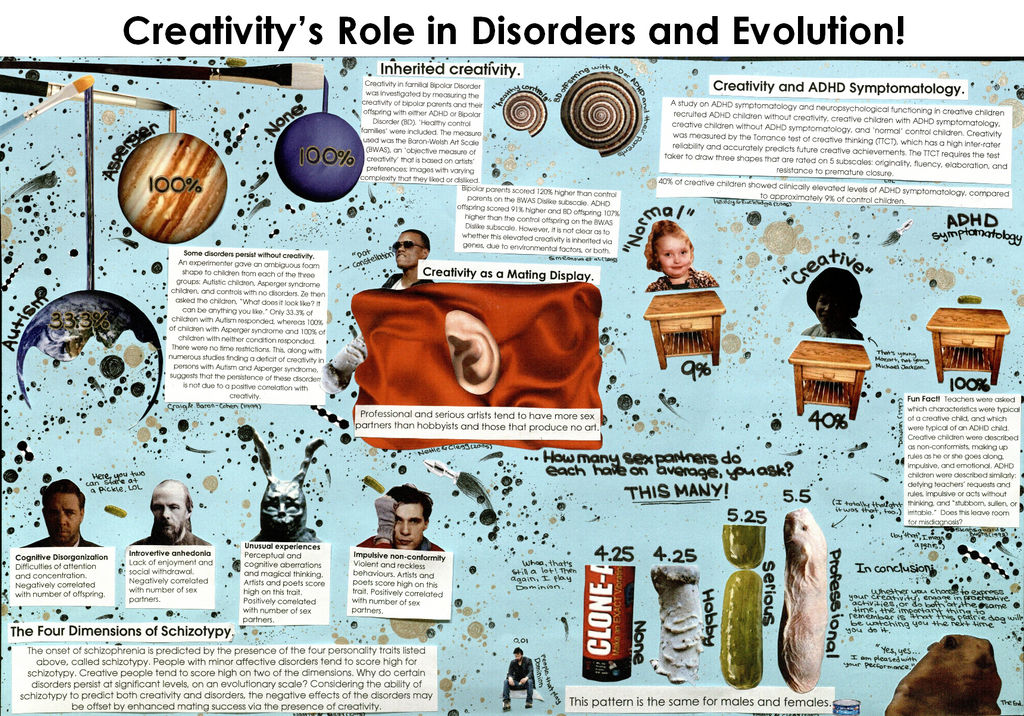
This fascinating piece of visual storytelling from DeviantArt, shows the potential of an infographic as a piece of art unto itself, and this one, at least to me, has what I’d call a compelling headline.
So, regardless of the veracity of the claims made by this very unique infographic, I am still drawn to it based on its layout, the style in which it is made, and the headline that grabs attention, even if the info found here is questionable.
Structured Content
Logical Flow: Organize the information logically, guiding the viewer through the content step by step.
Hierarchy: Use headings, subheadings, and bullet points to create a hierarchy of information, making it easy to follow.
Example:
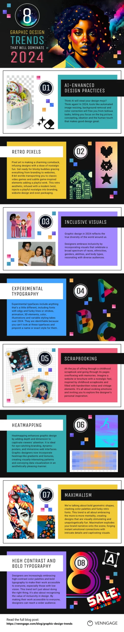
This infographic, found over on Venngage, does what many infographics do and is meant to be read vertically, from top to bottom.
As such, each segment of the infographic has its own style, yet shares a common font within the body text, and header fonts are also the same in each section.
From there, we see differences in style, almost like a different person made each section. Overall, this does illustrate the concept of “structured content”, thus providing logical steps for the viewer / reader to follow.
Data Accuracy
Reliable Sources: Ensure all data and information are accurate, up-to-date, and sourced from reliable references.
Proper Attribution: Include citations or credits for any data, images, or other content sourced from external materials.
Example:
When it comes to data accuracy, what I often see the most is either “Source: <the actual source>”, or “According to: <whoever it’s according to>”, and this one has both.
Of course, this is a graphic so you can’t click on any hyperlinks, but still, when there is data presented, to prove that you (as the maker of the graphic) aren’t just making things up, it’s always reassuring to claim your sources, and hopefully they’re real!
Visual Appeal
Design Consistency: Maintain consistency in fonts, colors, and styles throughout the infographic to create a cohesive look.
Color Scheme: Use a harmonious color palette that enhances readability and emphasizes key points without overwhelming the viewer.
Typography: Choose readable fonts, and use size and weight variations to highlight important text.
Example:
Visual appeal is really quite subjective. Some people enjoy less cluttered compositions when it comes to infographics, while some prefer to pack in as many details as humanly possible.
Infographics, from what I’ve seen, can get very unruly in terms of people showing off their ability to jam pack the composition with an absurd amount of detail.
Then again, I will admit, sometimes the amount of information being presented seems to warrant an almost freakish amount of graphical and statistical ability.
The above graphic, at least to me, has a certain refined appeal that seems both clinical and slightly fun at the same time.
Effective Use of Graphics
Icons and Illustrations: Use icons, illustrations, and other visual elements to represent information visually and break up text.
Charts and Graphs: Include well-designed charts, graphs, or diagrams that make the data easy to understand at a glance.
Example:
This infographic, as you can see if you study it closely, has some cool elements that give the impression of someone who knows how to handle graphics software, at least to an extent.
Then, as I kept looking at it, I noticed that there’s something up with the markers, and the shadows cast by the markers (if that’s what those are supposed to be). Hey, is this thing even geographically accurate?
Anyway, it has a certain visual flair, and it has that sort of rendered, slightly colour-gradient version of Earth.
I guess the point is, even when something may have graphical inconsistencies, the overall graphic effect still grabbed me, so here we are!
Concise Text
Brevity: Keep the text brief and to the point, using bullet points and short sentences to convey information quickly.
Clarity: Ensure the language is clear and free of jargon that might confuse the audience.
Example:
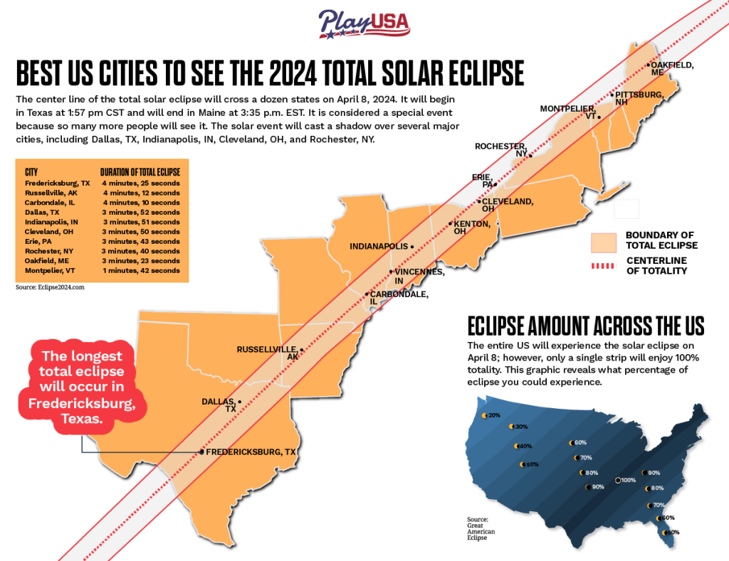
This infographic has a fair bit of text, and the text isn’t trying to be too flowery. Rather, it’s trying to convey facts, so that if one were to go out to watch the eclipse in the US, this infographic would be a helpful guide.
Remember the weird abstract infographic from earlier in the article? Well, this one is much more of a mini science lesson, that anyone with a high school education can read and grasp.
As long as you know words like “occur” and “boundary”, as well as names of cities in the US, you could have actually used this infographic. Bravo!
Balanced Layout
White Space: Use white space strategically to avoid clutter and ensure the infographic is easy to read.
Alignment: Ensure that elements are properly aligned to create a neat, professional appearance.
Example:
![]()
Balance in a graphic or image is achieved in many ways, whether it’s through colour contrasts, or the distribution of elements throughout the image that either make it look balanced or lopsided.
There’s no need to make it look mega ultra symetrical, while at the same time, I was told in art school that if the viewer’s eye wandered off the canvas, it might never come back.
Here, this Paleohacks infographic is definitely keeping an eye on things being balanced. Everything looks very simple, agreeable, and focused on the facts.
The colours aren’t jarring, and it does its best to convey information without making anyone too angry. Pretty chill!
Call to Action (CTA)
Engagement: If relevant, include a call to action that encourages the viewer to take the next step, such as visiting a website, sharing the infographic, or learning more about a topic.
Example:

This infographic by the SnapStats has a simple, bottom-of-the-page call-to-action (CTA) that basically is positioned so that you read the infographic, and you want to know more.
Of course, this is a graphic that you can’t click, and I see no phone number. I’m also not sure who “me” is. At any rate, this infographic does feature a very clear CTA, even if I don’t know how to carry it out.
I have no particular issue with the graphic itself, although it could be argued that one might think the BC Real Estate Association is maker of this graphic, or perhaps SPEEDO, but I think it’s actually SnapStats.
Shareability
Platform Suitability: Design the infographic to be easily shareable on social media, websites, or print. Consider the dimensions and resolution based on the platform where it will be shared.
Mobile-Friendly: Ensure the infographic is legible and visually appealing on mobile devices, as many users will view it on smaller screens.
Example:

This is a very appealing looking lime-infused mainly green infographic by .. hmm, by who?
See, this is one of those examples of a graphic that I actually lost track of where I got it, and there’s no source listed, no credits anywhere. There’s even a call-to-action that I can’t click or who who is providing the treatment option.
Anyway, I do like this graphic. I would share it, as I do like what it says, and the way it all comes across.
Branding
Consistency: Incorporate your brand’s colors, fonts, and logo subtly to maintain brand identity without overpowering the content.
Subtle Promotion: While the focus should be on providing value, subtle branding can reinforce brand recognition.
Example:
Ah, branding! It doesn’t always appear on all infographics, but usually it’s there somewhere – a simple namedrop.
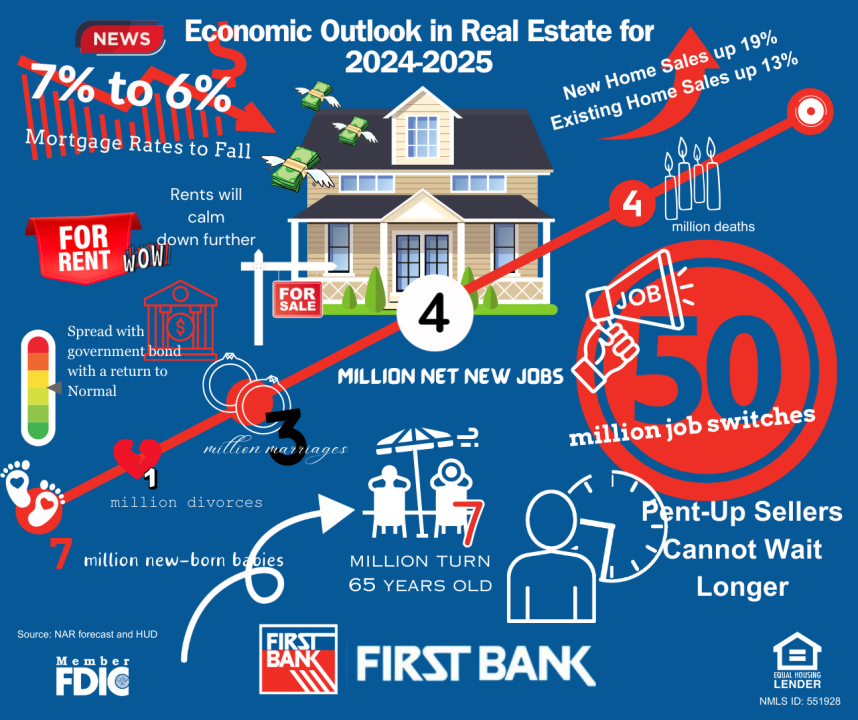
Other times, it is front and center, like in this rather jumbled infographic by First Bank.
Sometimes the graphic doesn’t need branding in the sense that it’s on the website that made it, thereby theoretically negating the immediate need for branding.
Of course, the second someone copies the image elsewhere, that person needs to mention where they got it, or those brand-less infographics could be interpreted as being made by the person who has nabbed them.
To me, branding just one more thing on the infographic, and I suppose if I really loved the infographic, then who made it would be important. Always good to sign your work, they say.
Conclusion
By combining these elements, an infographic can effectively convey complex information in a way that is engaging, informative, and memorable.
For marketing purposes, they can be very effective, and – who knows – it might go viral! (if so, make sure your name is on it)