
Hi, Dave Fox here from Starscape SEO. Ah, tooltips—those small pop-up messages that appear when you hover over an element—were once heralded as a way to provide additional guidance and explanation without cluttering a user interface (UI).
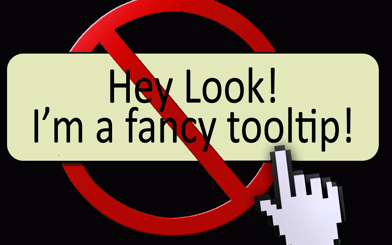
Initially, they seemed like a perfect solution: unobtrusive, informative, and helpful. However, in practice, they’ve gained a reputation for being annoying, redundant, and stressful for users.
But why? Where did tooltips come from, and what are they supposed to accomplish? More importantly, why do so many people seem to hate them now?
The Origins of Tooltips: From Helpfulness to Hassle
Tooltips have been part of the user experience (UX) toolkit for decades.
Their original purpose was simple: to provide users with helpful information about a specific UI element when they hovered over or interacted with it.
This additional information was meant to clarify an action, explain the functionality of an icon, or provide context where it wasn’t immediately obvious.
The premise of the tooltip was that users often need a bit more information than what’s visually provided.
Whether it was a new piece of software or a particularly complicated web form, the tooltip could explain features or functionality without requiring the user to navigate away from the page or open a help document.
In the early days of web design, when interfaces were often unintuitive and documentation scarce, this made sense.
However, as interfaces have become more intuitive and minimalist, the need for tooltips to explain basic functionality has diminished. Despite this, tooltips are still widely used, often to their detriment.
What Tooltips Are Supposed to Do
At their best, tooltips guide users through a process, help them discover hidden features, and make complex interfaces easier to use. According to user experience design principles, good tooltips are:
Relevant: They provide useful, timely information that the user might not already know.
Valuable: They add new information that helps the user complete an action or better understand the interface.
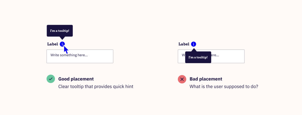
Contextual: They appear in the right place at the right time, triggered by a relevant user action (e.g., hovering over a confusing icon).
For example, a well-designed tooltip might explain that clicking an obscure icon will open advanced settings, something that isn’t immediately obvious from the icon itself.
In this case, the tooltip is genuinely helpful because it adds value that the user wouldn’t have easily deduced.
The Downside of Tooltips: When They Fail Users
Unfortunately, tooltips have gained a bad reputation because, more often than not, they are misused. A poorly designed tooltip can be redundant, distracting, or even frustrating.

Here’s why:
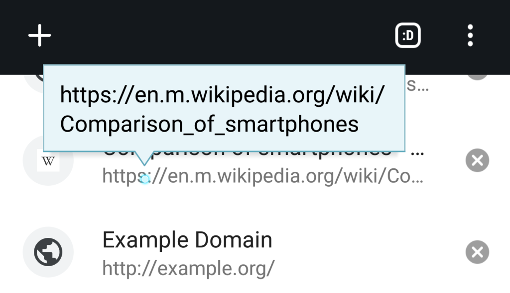
Redundant Information Many tooltips state the obvious, providing no new information. For example, a tooltip on a “Save” button that says “Click here to save your work” adds no value.
The user already understands what the “Save” button does based on years of interacting with digital interfaces. This type of tooltip doesn’t guide or teach—it only interrupts the flow of the user’s interaction, adding an unnecessary layer of friction.
Poor Timing Timing is everything when it comes to tooltips. If a tooltip appears too early—before the user needs it—it feels intrusive and disruptive.
If it appears too late, it’s no longer useful because the user has already completed the action or figured out the interface on their own. Tooltips need to appear at the precise moment when users are likely to need the information, otherwise, they become an annoyance.
Irrelevant Audience Tooltips are often shown to all users, regardless of their experience level. A first-time user might benefit from a tooltip explaining how to complete a specific task, but a seasoned user doesn’t need that same level of hand-holding.
Without segmentation, where different tooltips are shown to different user groups, tooltips become a nuisance for experienced users who already know the interface.
Tooltip Overload Bombarding users with too many tooltips at once can overwhelm and frustrate them. Instead of helping users navigate the interface, excessive tooltips feel like interruptions, forcing users to constantly dismiss pop-ups in order to continue working.
The Psychology Behind Why Tooltips Stress Us Out
To understand why tooltips can cause stress, it’s helpful to look at BJ Fogg’s Behavior Model, which explains that users take action when three core elements converge: motivation, ability, and a prompt.
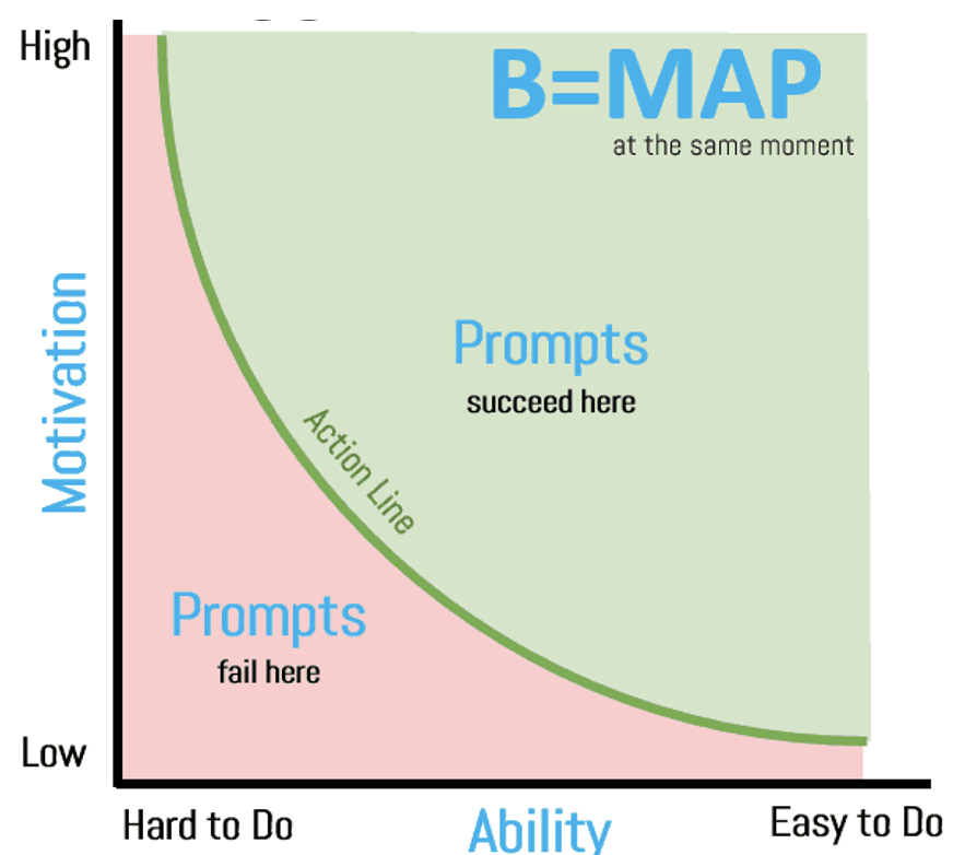
A tooltip serves as a prompt, but for it to be effective, the user must already be motivated and capable of completing the action.
When tooltips appear out of context or state the obvious, they break this model. Instead of helping users succeed, they annoy them by pointing out things that are either intuitive or irrelevant.
Why Good Tooltips Matter: Examples of Effective and Ineffective Design
Terrible Tooltip Example: Imagine a product with a “plus” icon that allows users to add new people to a team.
Now, picture a tooltip that says, “Click the + button to add people.” This tooltip is not only redundant—it’s insulting to the user’s intelligence.
The interface already clearly communicates what the button does, making the tooltip feel like an unnecessary intrusion.
This is a prime example of bad tooltip design: it adds no value, it’s redundant, and it interrupts the user experience rather than enhancing it.
Good Tooltip Example: Now, contrast this with a well-timed tooltip in a more complex system, such as graphic design software.
A tooltip might explain that holding down the “Shift” key while resizing an object keeps the proportions consistent.
This is a subtle but powerful tip that even experienced users might not know. It provides useful, non-obvious information exactly when it’s needed, making the user’s experience smoother and more efficient.

Improving Tooltip Design
To make tooltips better, designers must consider both when and to whom they’re shown. Here are a few key strategies for improving tooltips:
Segment Your Users: Show tooltips only to users who need them. First-time users might benefit from a basic explanation, while advanced users should see tips for more complex features.
Provide Value: Ensure that the tooltip adds new, non-obvious information. If the interface element is self-explanatory, skip the tooltip.
Context and Timing: Tooltips should appear at the right moment—when the user is interacting with a feature that might need further explanation.
Conclusion: Don’t Blame the Tooltips
The problem isn’t with tooltips themselves—it’s with their design and implementation. When used thoughtfully, tooltips can help users learn and navigate more efficiently.
However, when poorly executed, they create stress and frustration by interrupting the flow and stating the obvious.
To design effective tooltips, focus on providing value, timing them correctly, and targeting the right users. By doing so, you can transform tooltips from an irritant into a genuinely helpful tool.
Call or Text Starscape SEO: (519) 208-8680